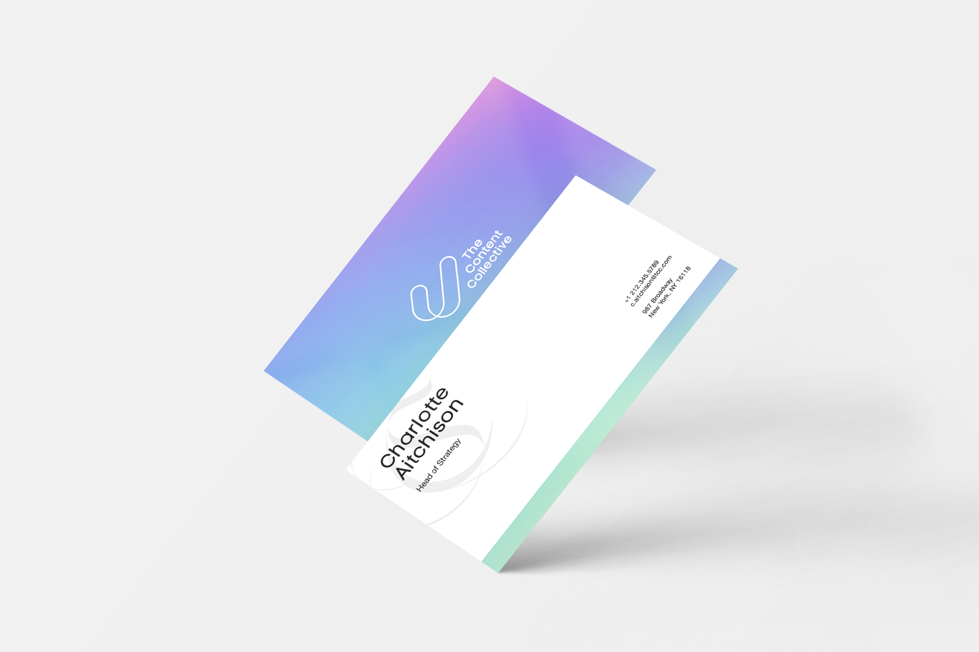
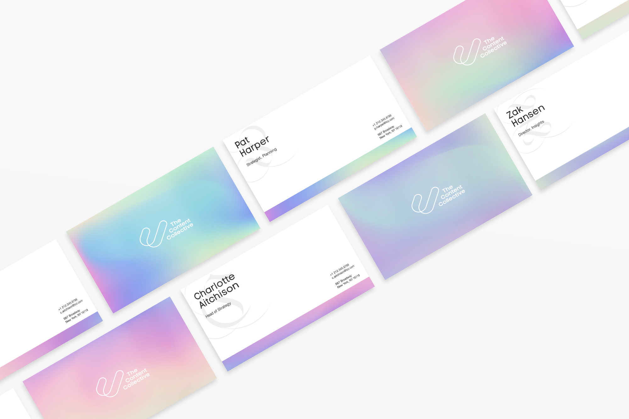
BRANDING + VISUAL IDENTITY
THE CONTENT COLLECTIVE
The Content Collective (TCC) is a creative ideas incubator within the Omnicom family. After fifteen years, TCC’s incredible work has been recognized, leading to client projects with explosive budgets. Some examples include: Pepsi x NFL, bubly x RuPaul’s Drag Race, and McDonald’s x Viacom Morning Rally. As a result of this shift, TCC needed a completely new logo and identity to match the calibre of its current clients.
The Problem: A dated brand that didn’t quite fit in with the calibre of its work
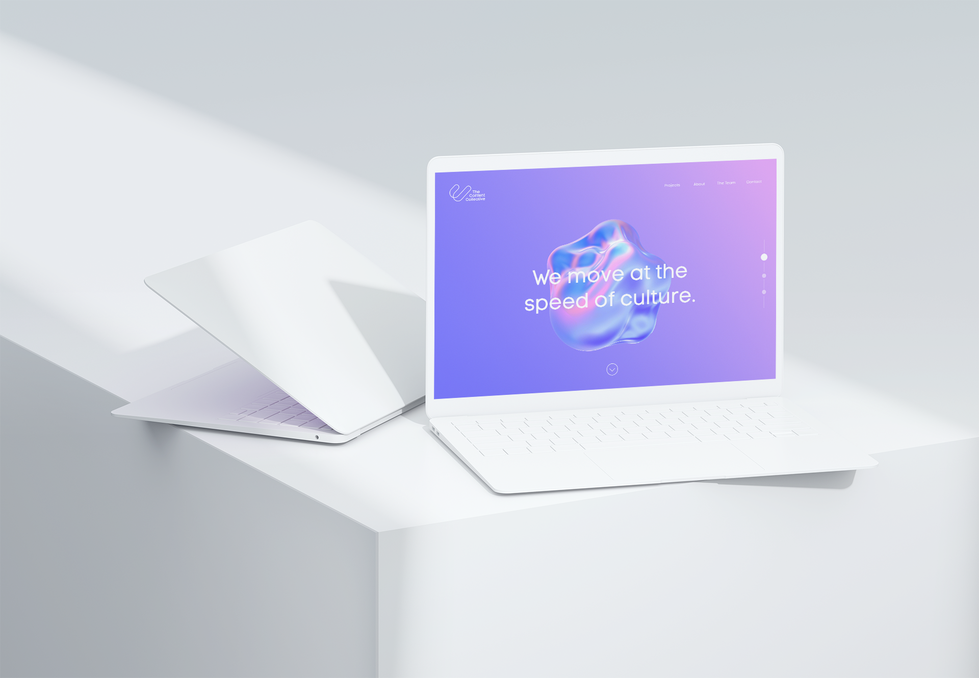
The Solution: “The Speed of Culture” - a positioning that communicates TCC’s core offering of capitalizing on and amplifying moments in culture, and informs a visual identity based on the amorphous and shifting role of culture in the world and in our lives.

Old to New
The old TCC logo, filled with gears, was reflective of who they were fifteen years ago - executional, and churning out ideas to get noticed. The association with gears is one that needed to be shed in order to mature and move into this new echelon of creation.
The Looping C
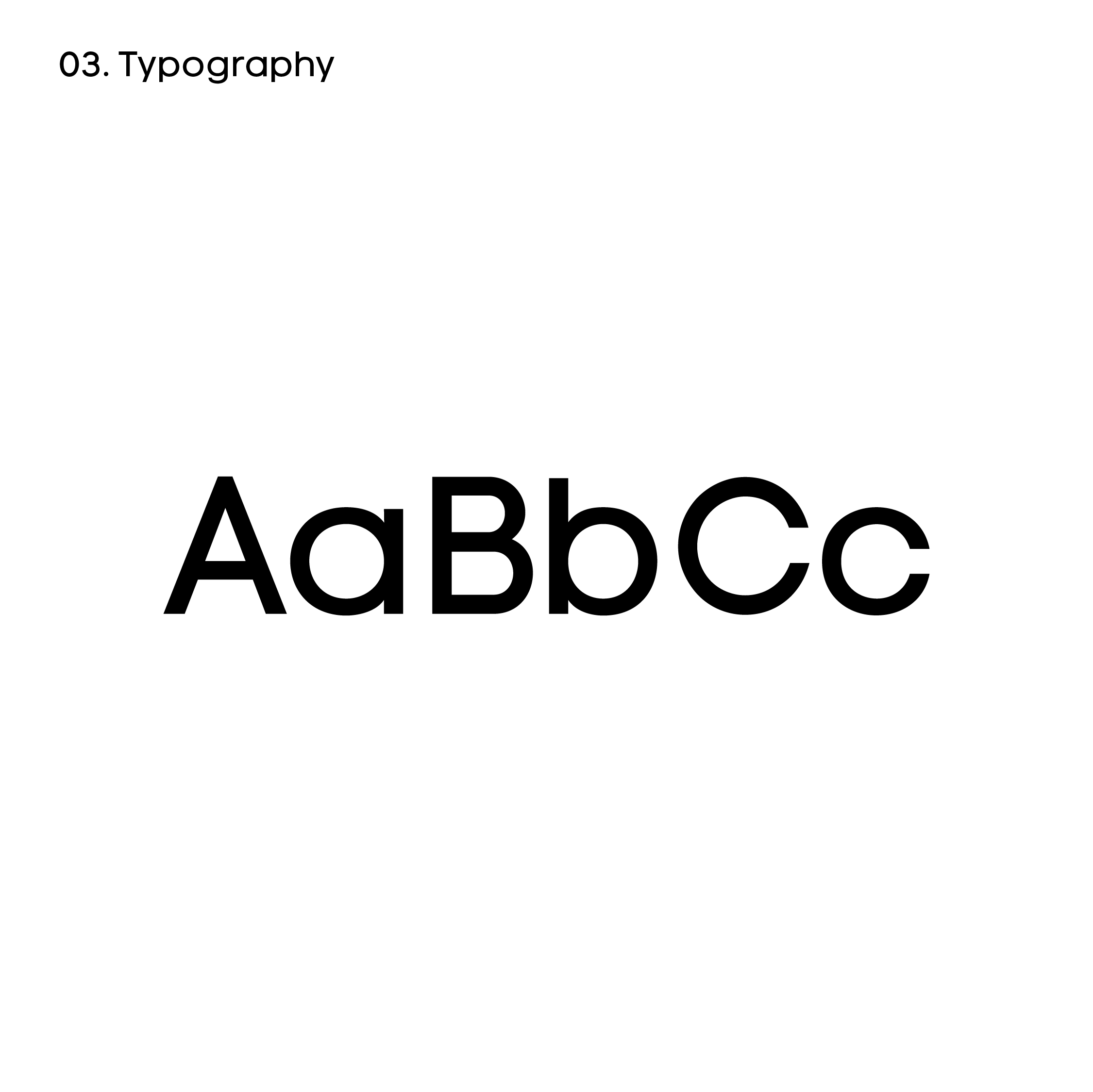
TCC’s new logo focuses on the two Cs of Content and Collective, coming together to form an endless loop and a third C: Culture. The typeface is set in Code Pro, helping to modernize the brand as well as tie it more closely to Omnicom Group.
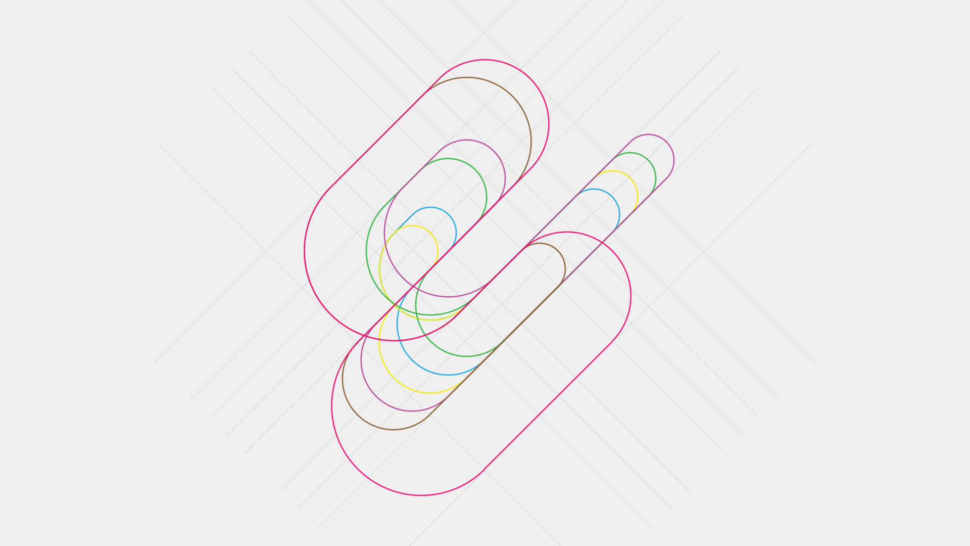
The logo was built on a grid of overlapping 45 degree angle lines, allowing for infinite scaling and morphing as illustrated above.
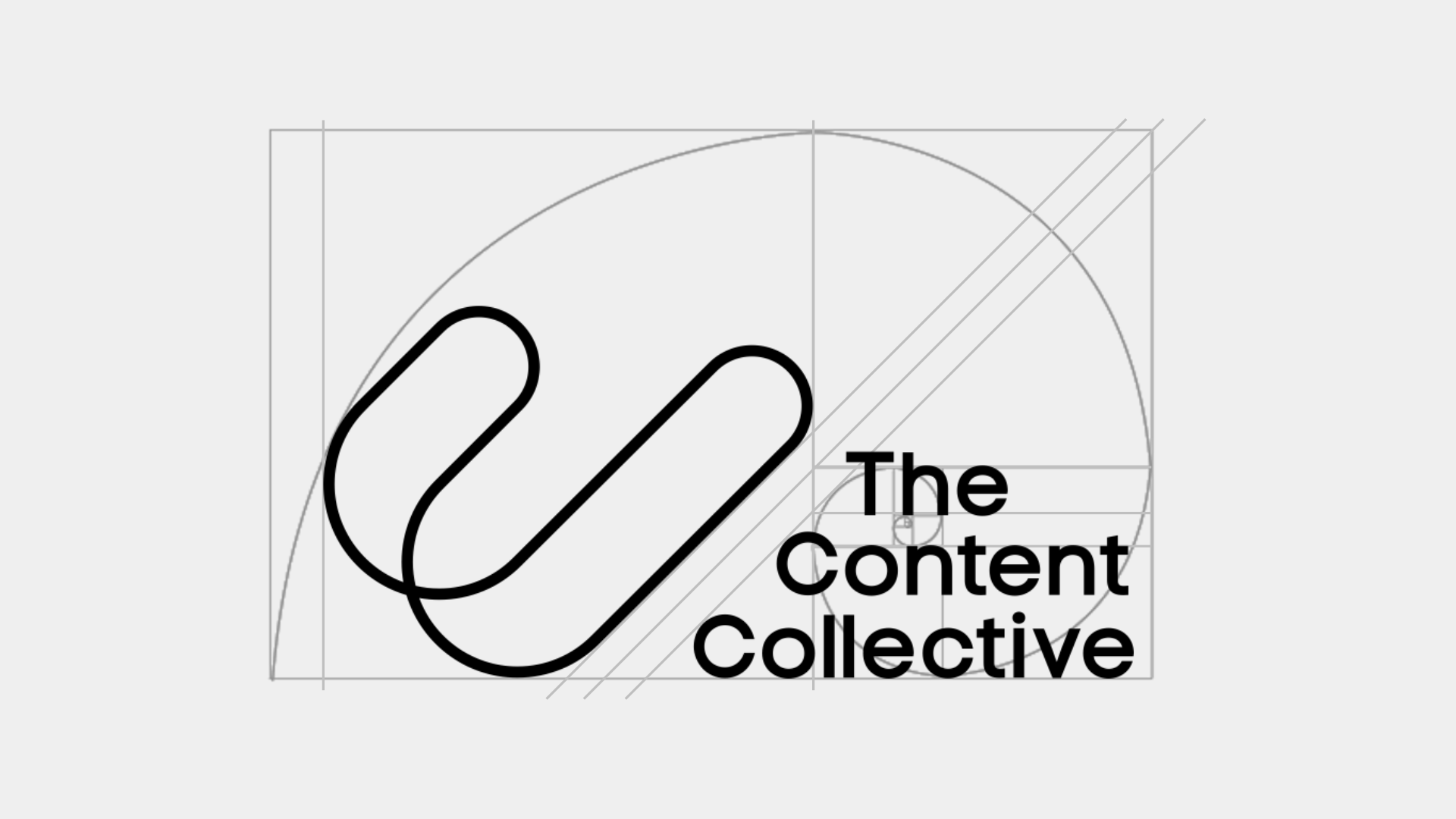
By applying the golden ratio to the logo mark and the word mark, I was able to achieve harmony between the two.
Visual System Elements

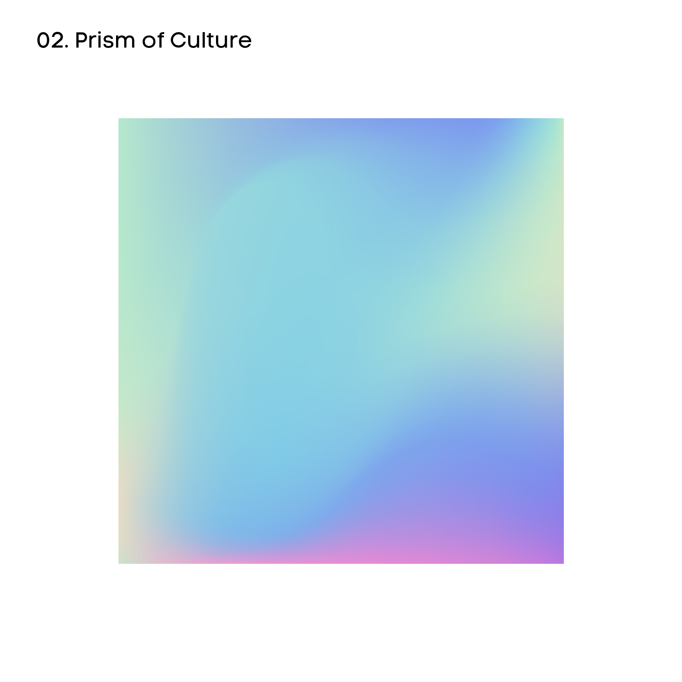
Putting it All Together
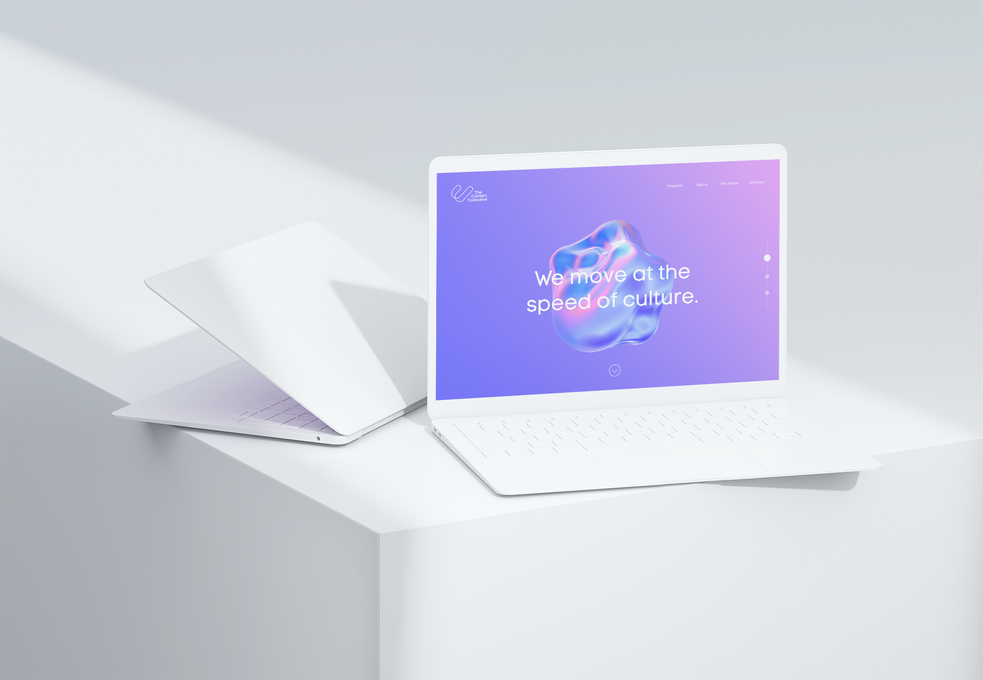
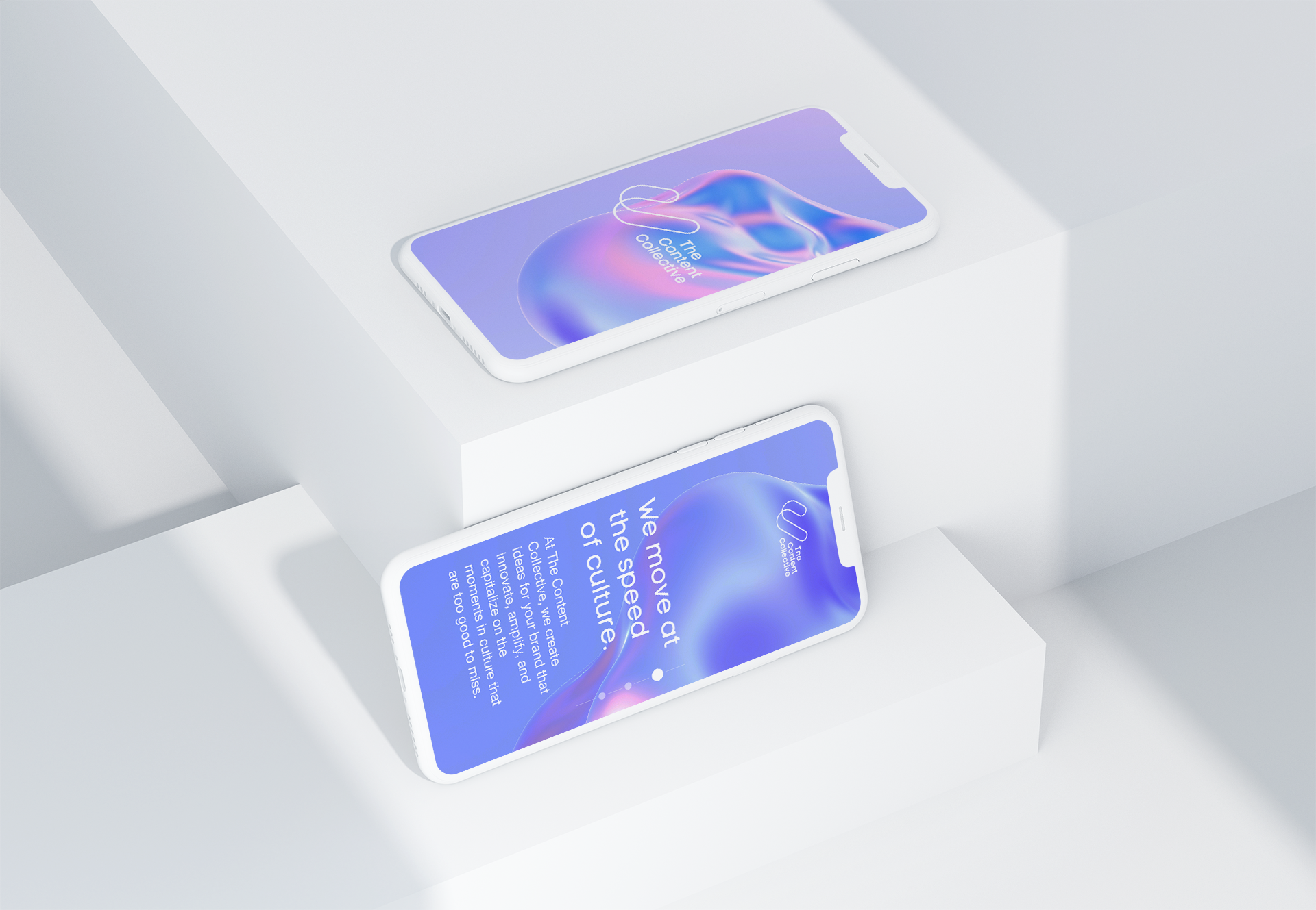
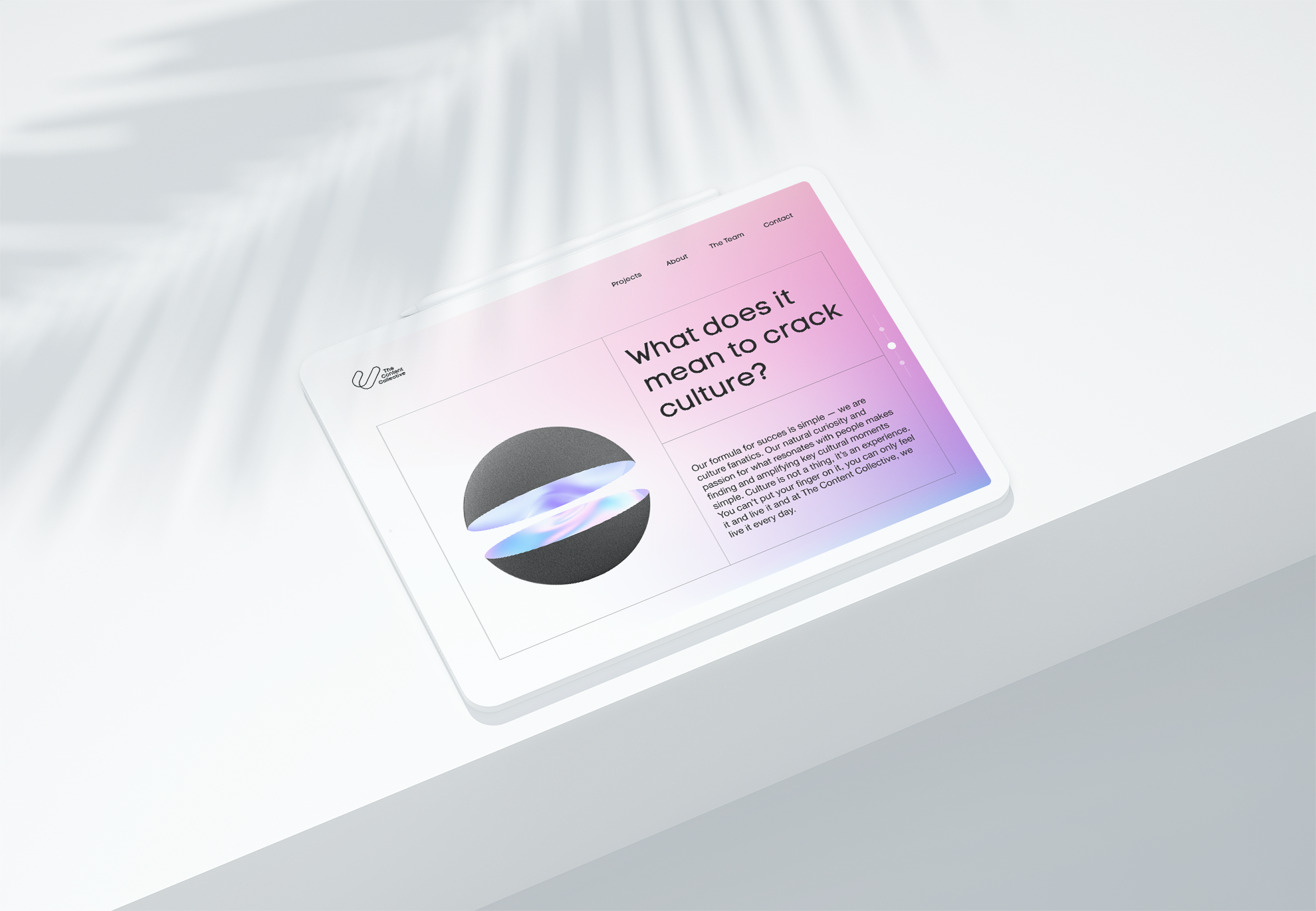
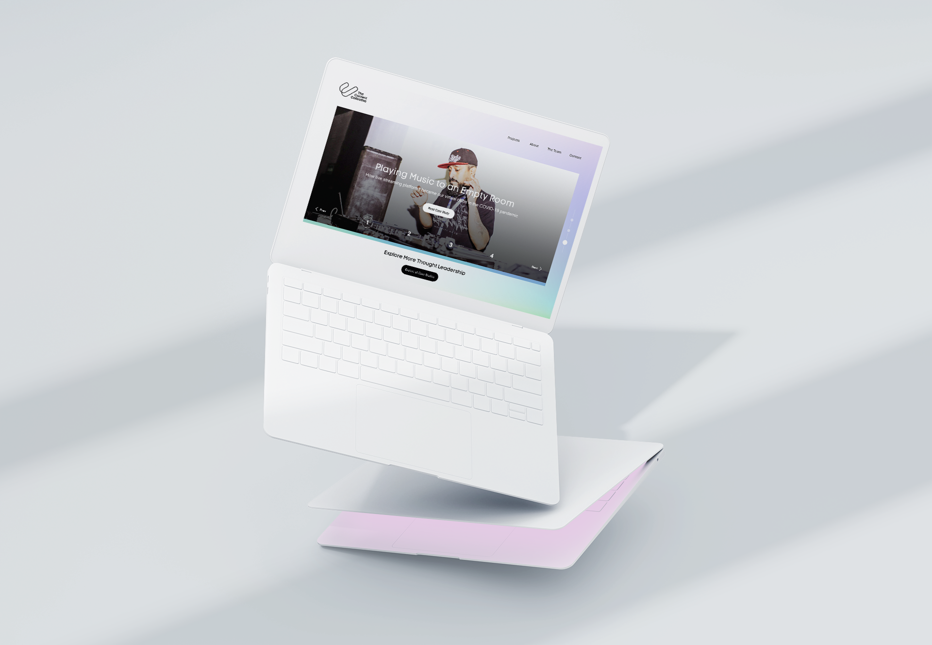
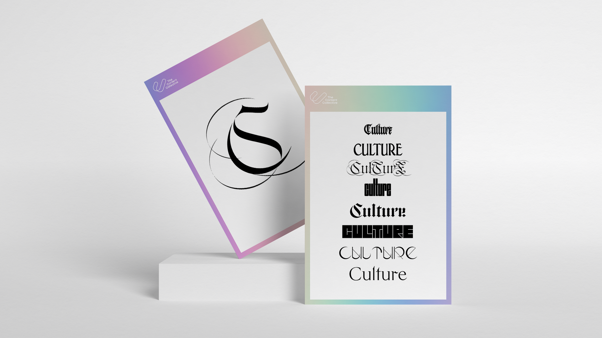
Keeping Pace With Culture
We incorporated many artful and trending typefaces to illustrate the amorphous nature of Culture. We anticipate changing these every so often to keep on the pulse of what is current.