BRANDING + VISUAL IDENTITY
RESOLUTION MEDIA
Resolution, the action of solving a problem or providing clarity
Resolution, the quality of being determined
Resolution, the smallest interval measurable by a scientific (especially optical) instrument
Though these are simple definitions for Resolution, they were perfect incubators for manifesting the three major pillars of this brand. I wanted the personality to provide clarity in the complicated and convoluted world of performance media. I wanted the positioning to communicate how determined Resolution’s seasoned employees were for being media pioneers. I wanted to create a visual identity that felt as precise and measurable as the ROI Resolution provides.
In the seven months that followed, I wrote countless brand manifestos and sketched piles of logos, pivoting from one prototype to the next until I landed on something that finally felt Resolution.
—
The Challenge: Modernize and simplify a dated brand with low awareness and the need to attract younger talent
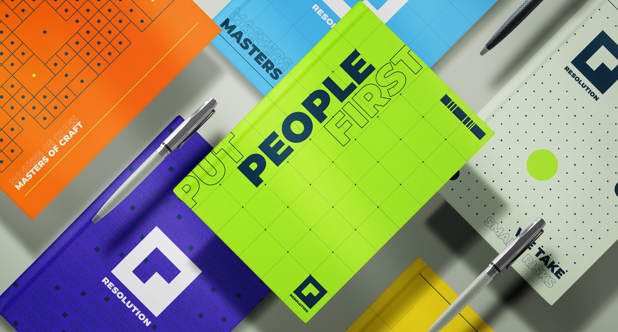
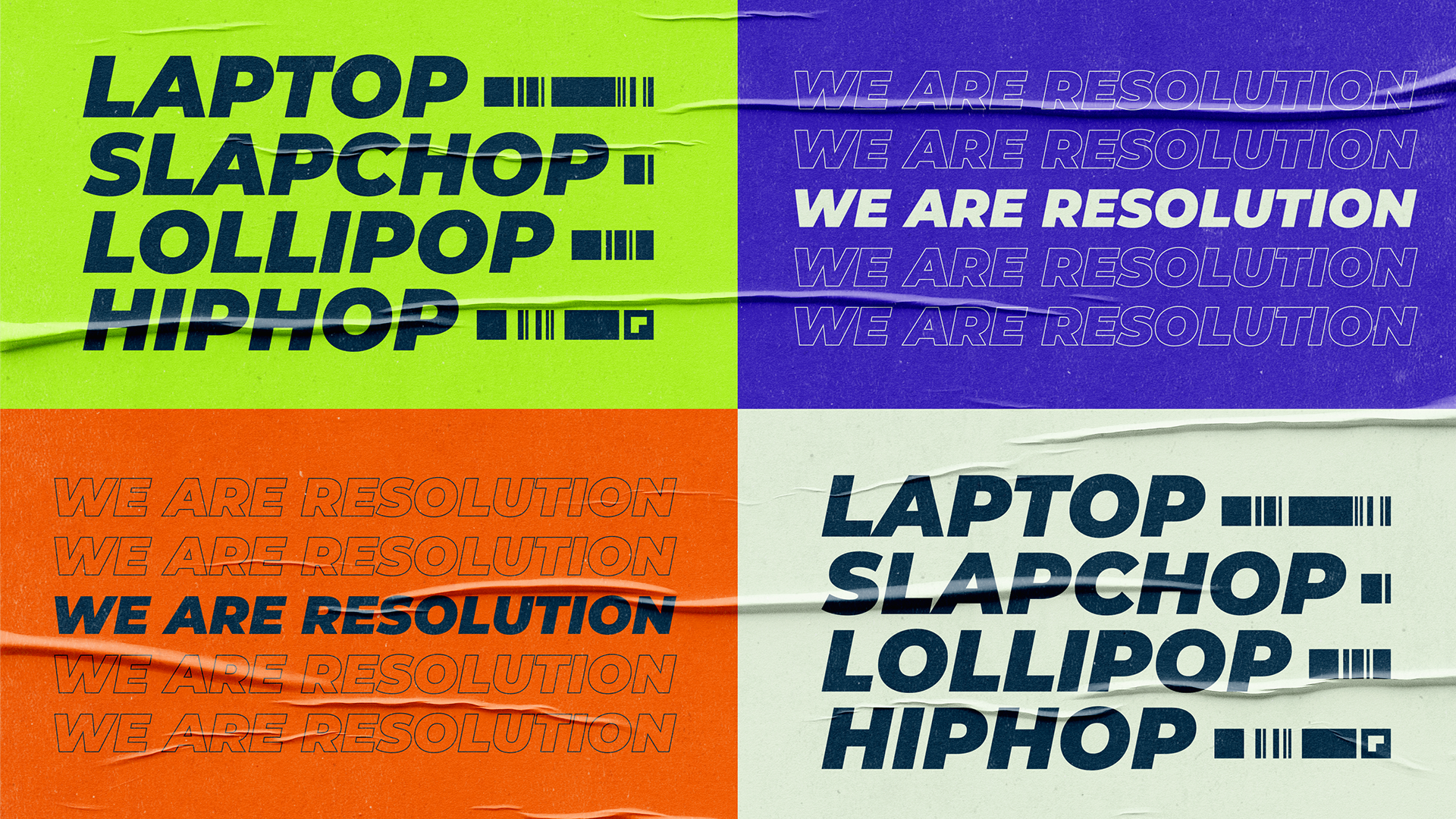
The Solution: “Masters of Craft” - a positioning focused on the expertise of Resolution’s seasoned employees coupled with a bold identity based on the pixel and strong typography
01. Research and Understanding
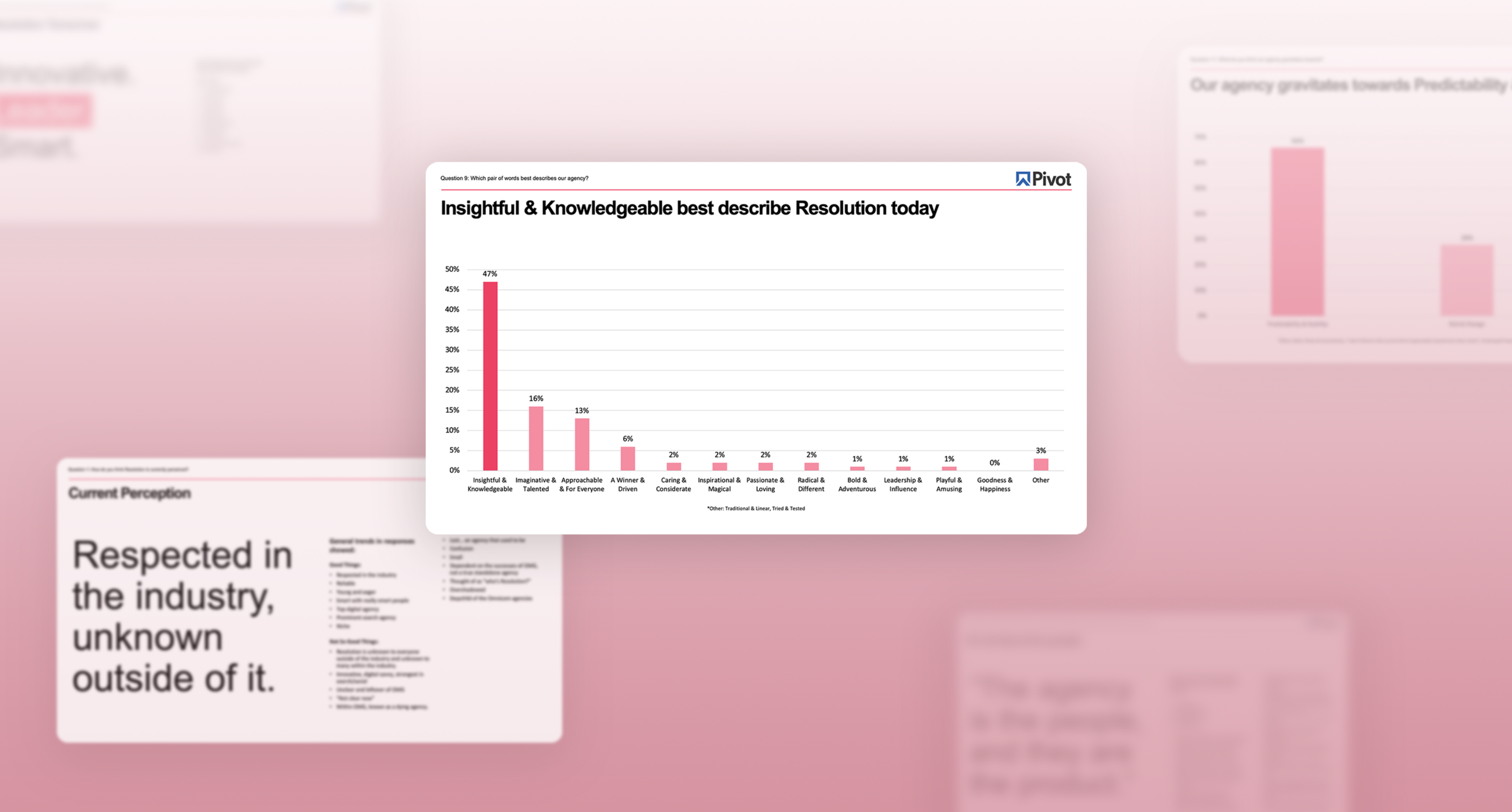
My first step in this rebrand was to hear from the people who have worked there for decades. I conducted in-person interviews and wrote and distributed an agency-wide survey to gain an intimate understanding of the problem Resolution’s people were facing.
From the survey, I was able to quantify qualitative research by reading each response and identifying frequency trends, which I synthesized and visualized to share with key stakeholders. From the interviews, I gained an understanding and empathized with the deep, emotional connection that employees have to the agency they have built. It was equally understood by everyone that Resolution needed to undergo a total overhaul while maintaining its legacy.
Three problems were clear:
No/Low brand awareness
The need to attract younger talent
Precision marketing is complicated
02. Brand Ideation
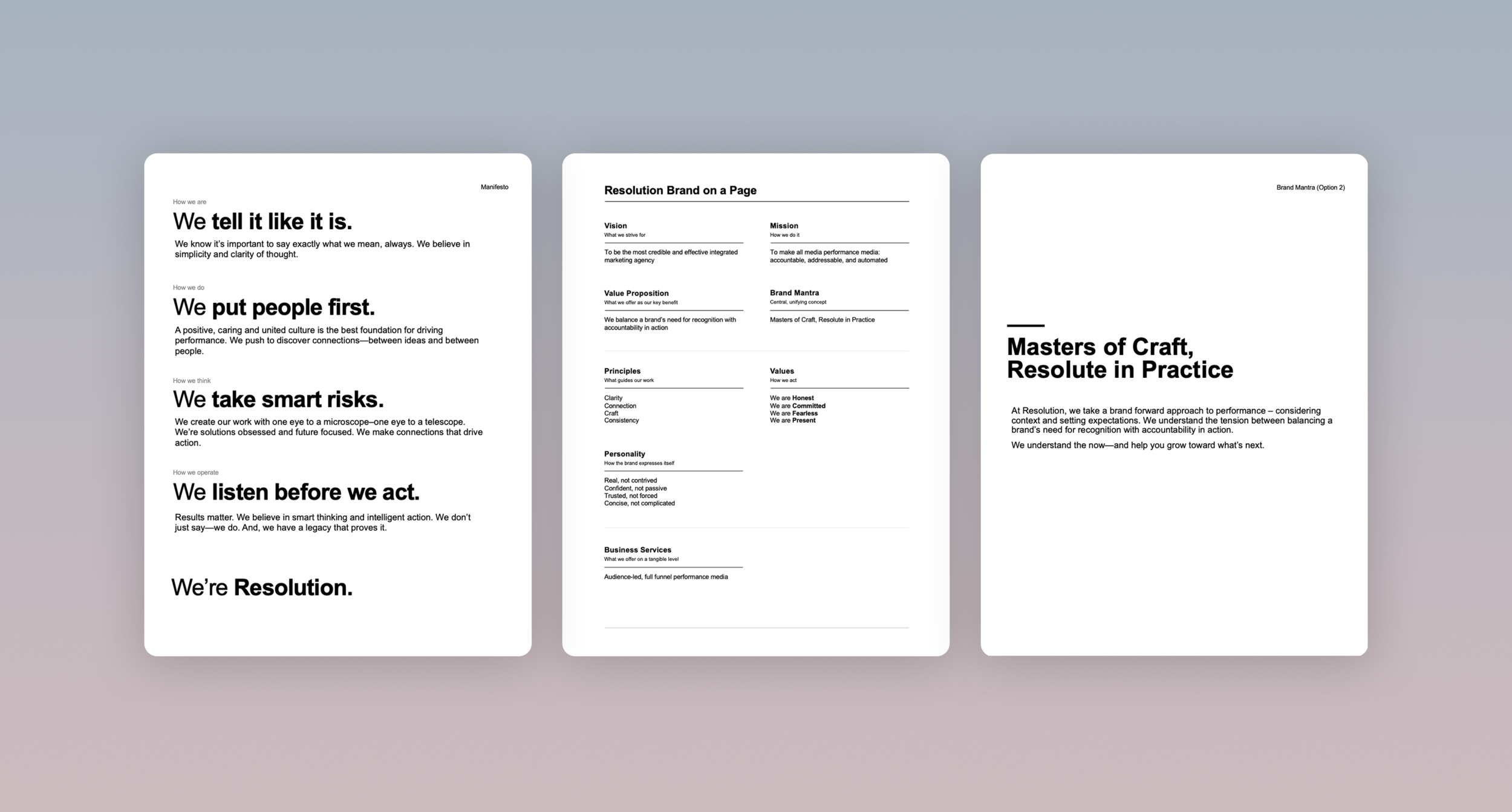
After defining Resolution’s core problems, I moved into ideation; specifically around language and brand ethos. Before any design, I conducted creative workshops, scribbled things on paper and ultimately crafted a brand on a page… which went through testing and learning cycles with Resolution executives and friends and family for about three months. This set the foundation for the brand and led to the development of Resolutions business approach framework.
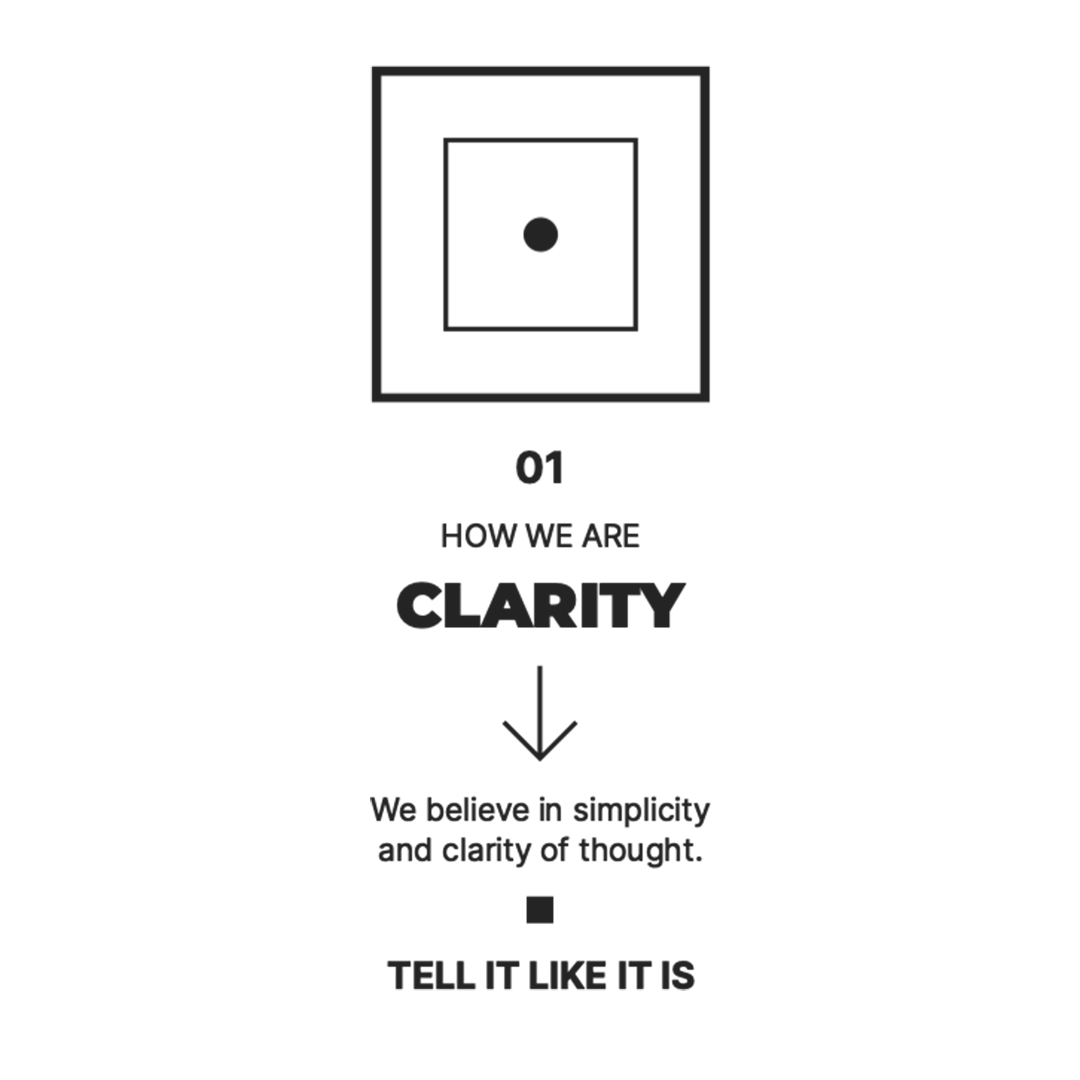
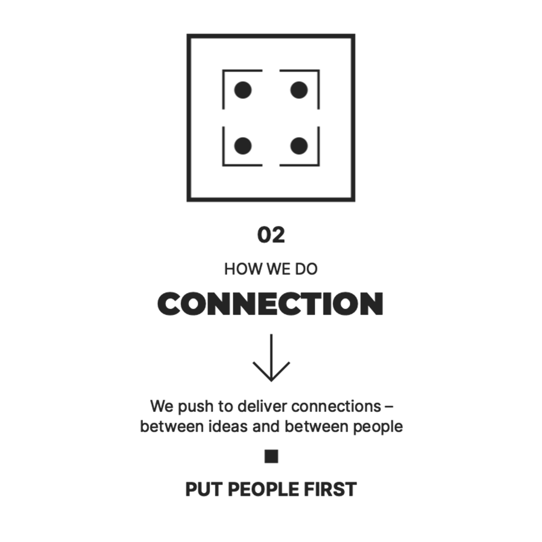
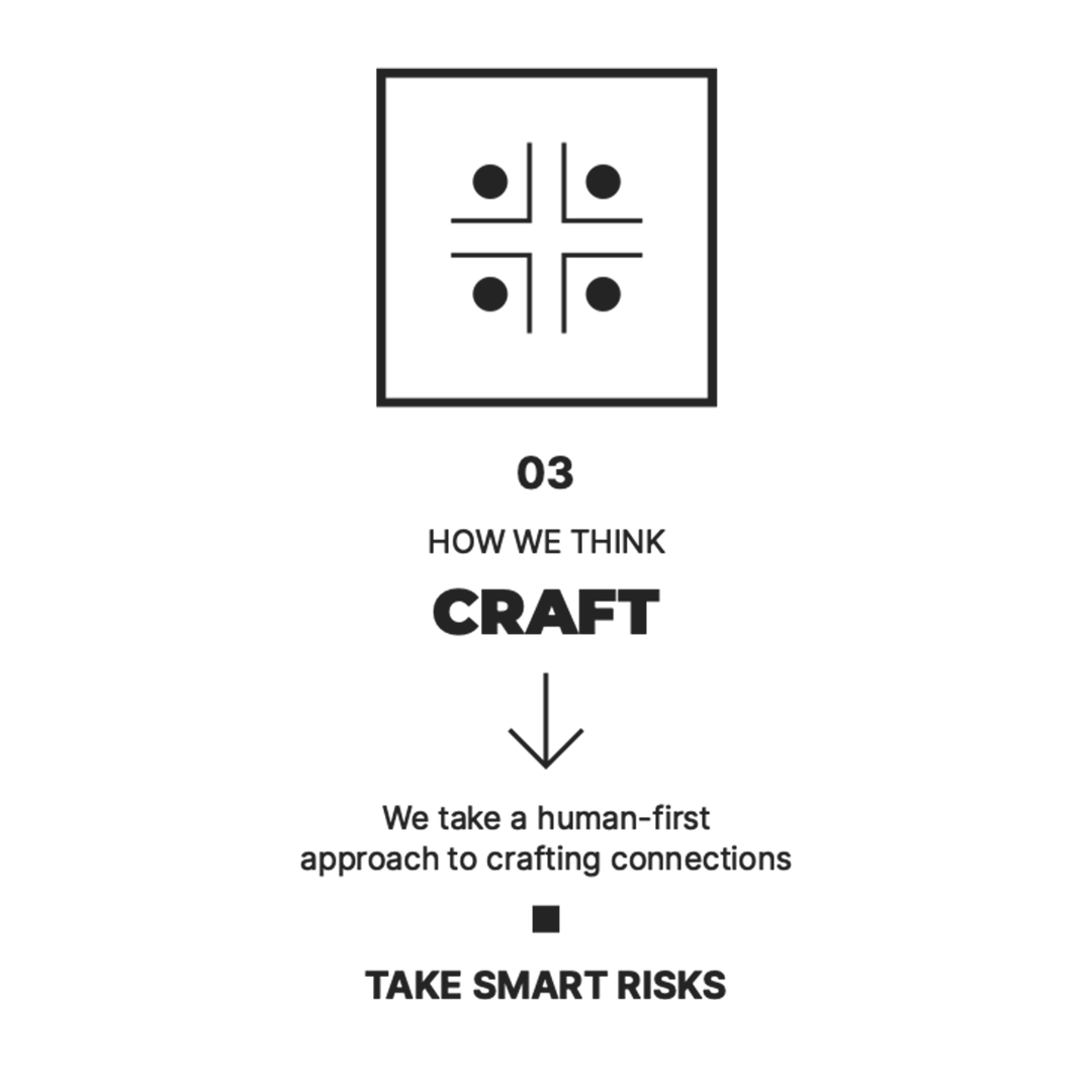
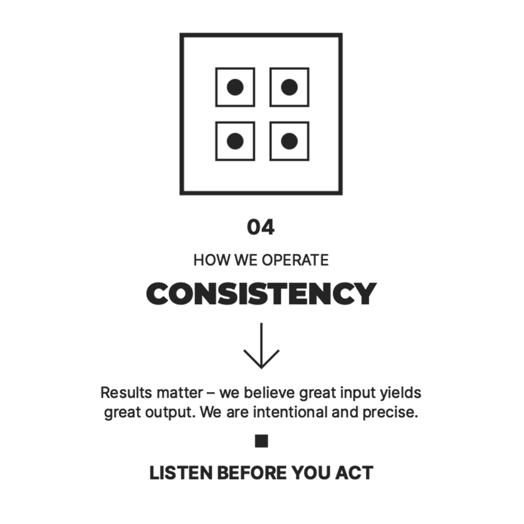
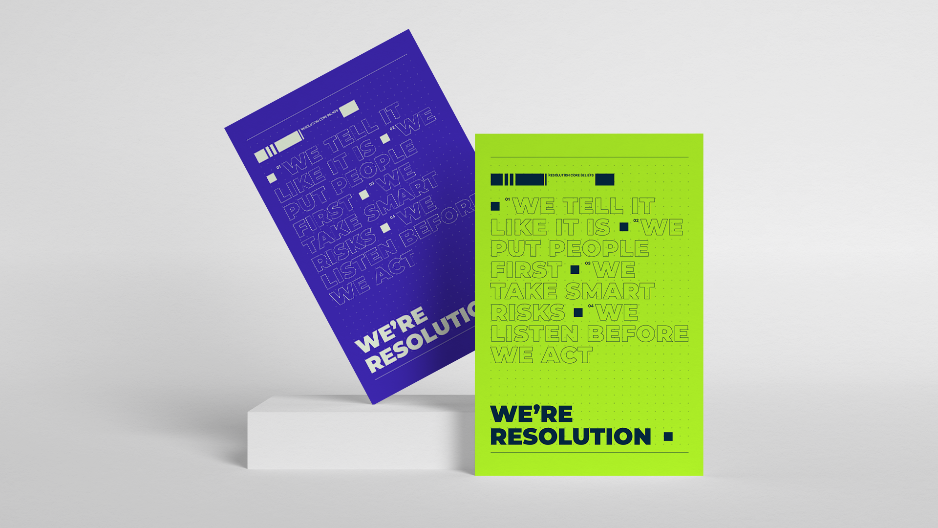
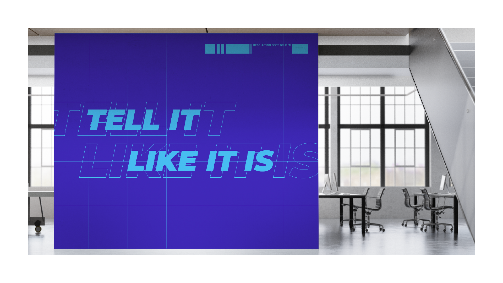
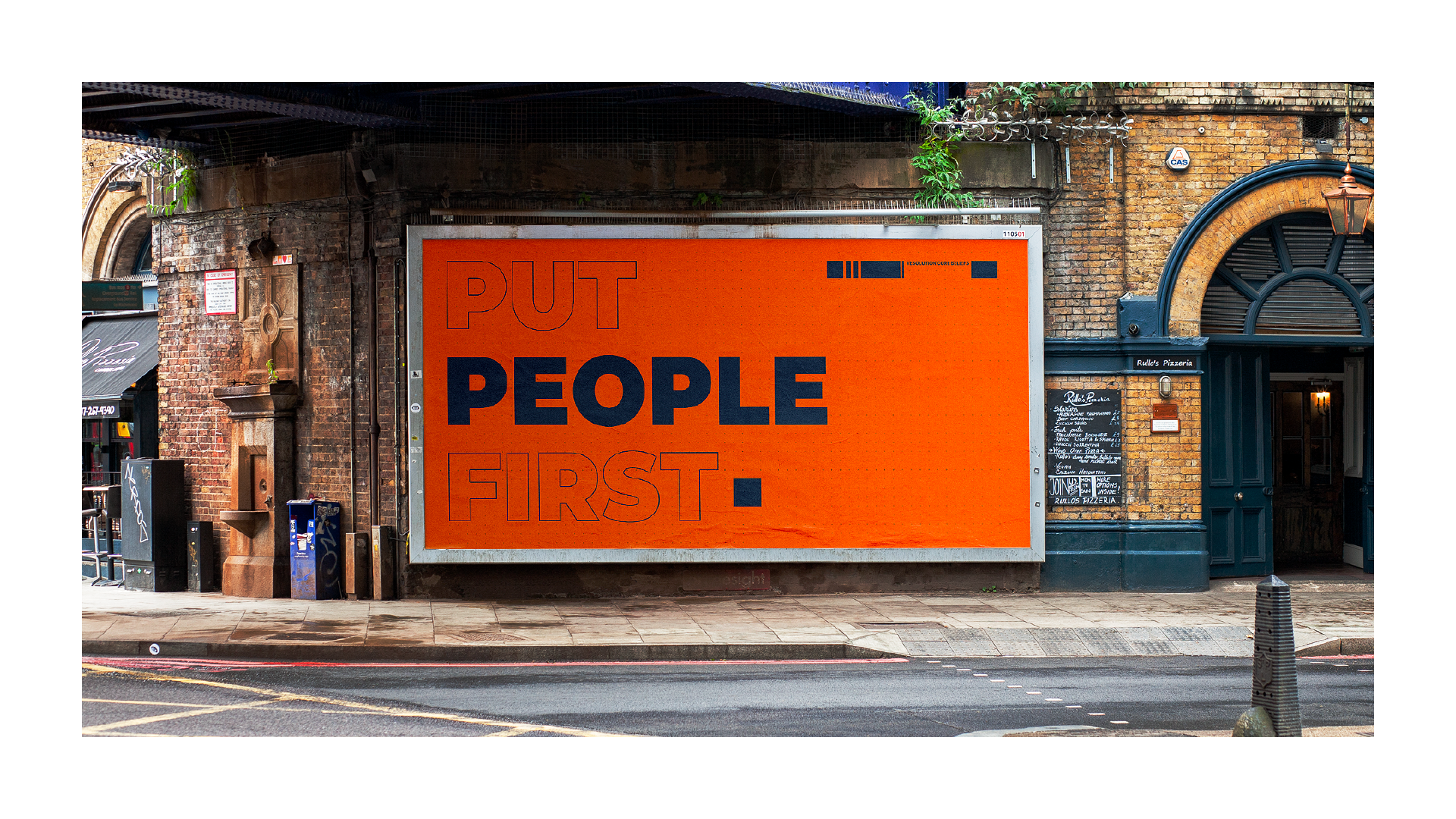
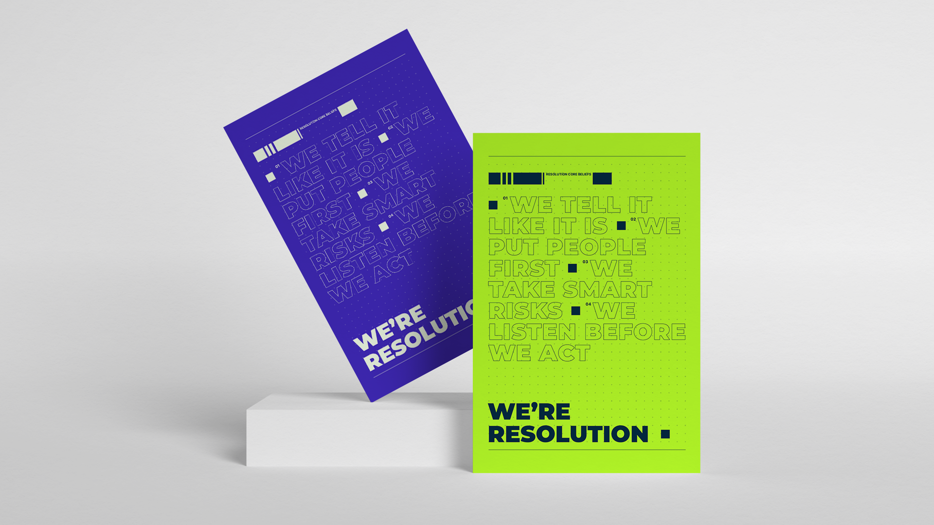
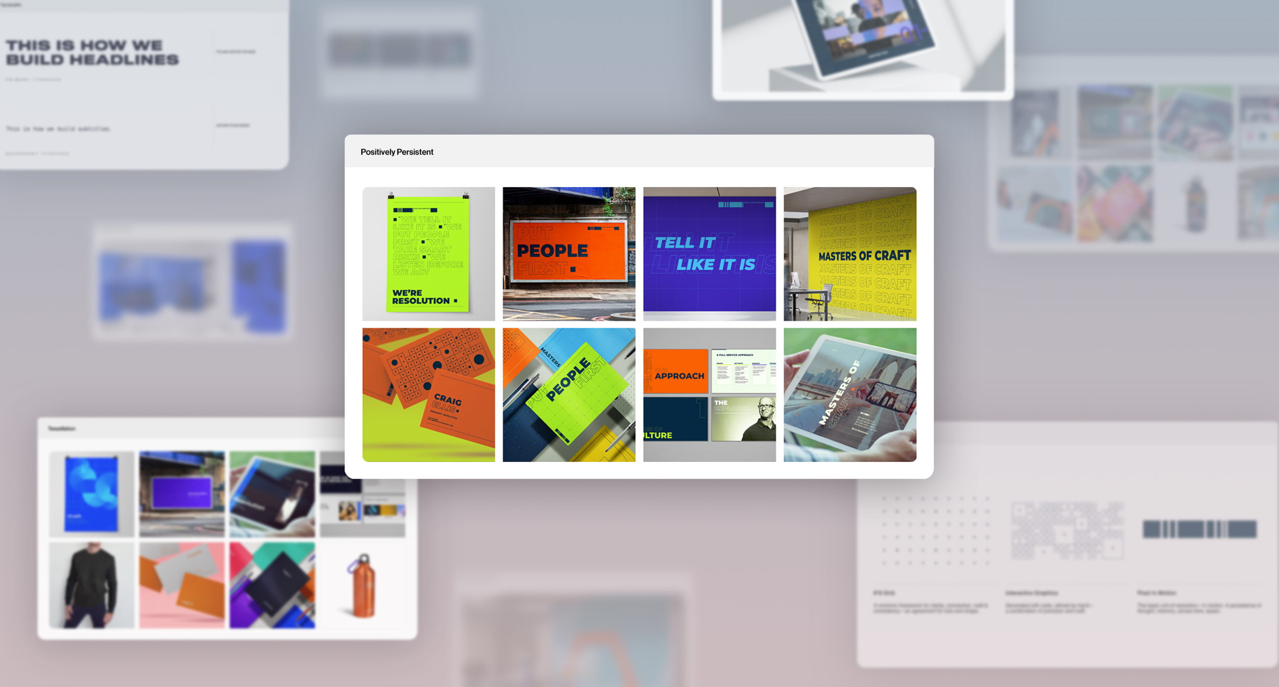
Included in the Brand on a Page are four core principles: Clarity, Connection, Craft, and Consistency - these are the pillars for how Resolution’s business operates. Each principle is accompanied by an associated value: tell it like it is, put people first, take smart risks, and listen before you act - these are the pillars for how Resolution’s people operate.
Business Approach
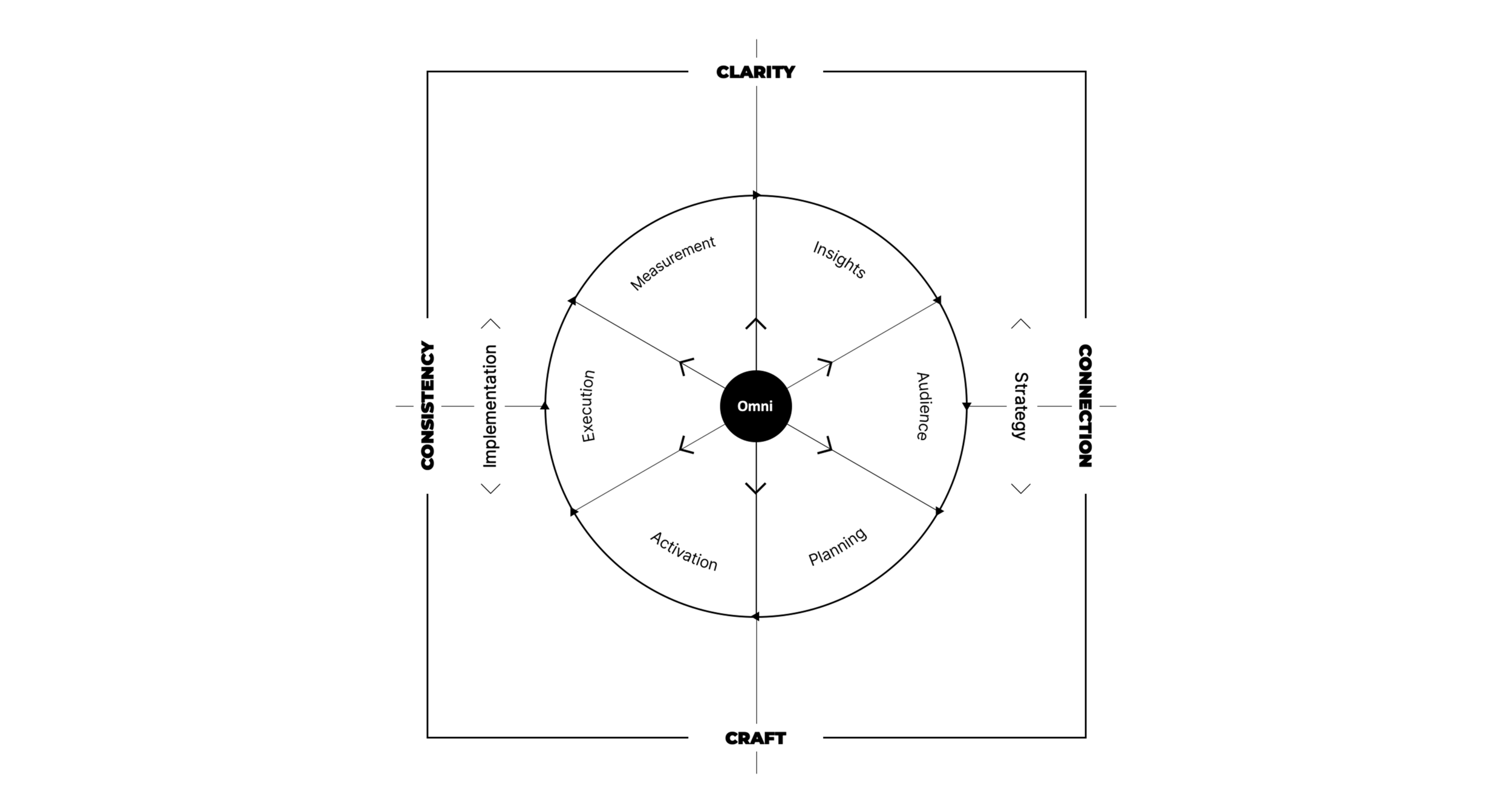
It felt obvious that Resolution’s core beliefs needed to be directly infused into their product, which is why the four principles create the framework in which Resolution’s core competencies live. Each one flows into the other in an endless cycle that informs and optimizes – all fueled by Omni, Omnicom’s people-based precision marketing and insights platform.
03. Prototyping Design Systems
Once the foundational brand elements were nailed down, it was time to begin design. Strategically, entire design ecosystems were created prior to the logo. The goal was to have Resolution choose the ecosystem that felt the most right for its evolution regardless of the logo sitting inside of it. That said, logos were being created in tandem behind the scenes.
This process began with a workshop of divergent ideation techniques involving my colleagues. Each mini-team was briefed prior to the workshop and brought a mood-board and initial design sketches that they believed best answered the brief. Upon comparison of the boards/ideas, common themes were identified and amplified into the principle focus of the prospective systems.
Many rounds of revision, testing and learning took place internally. The outcome was three distinct design systems: one type focused, one shape focused, and one pattern focused.
04. Ideating Logos
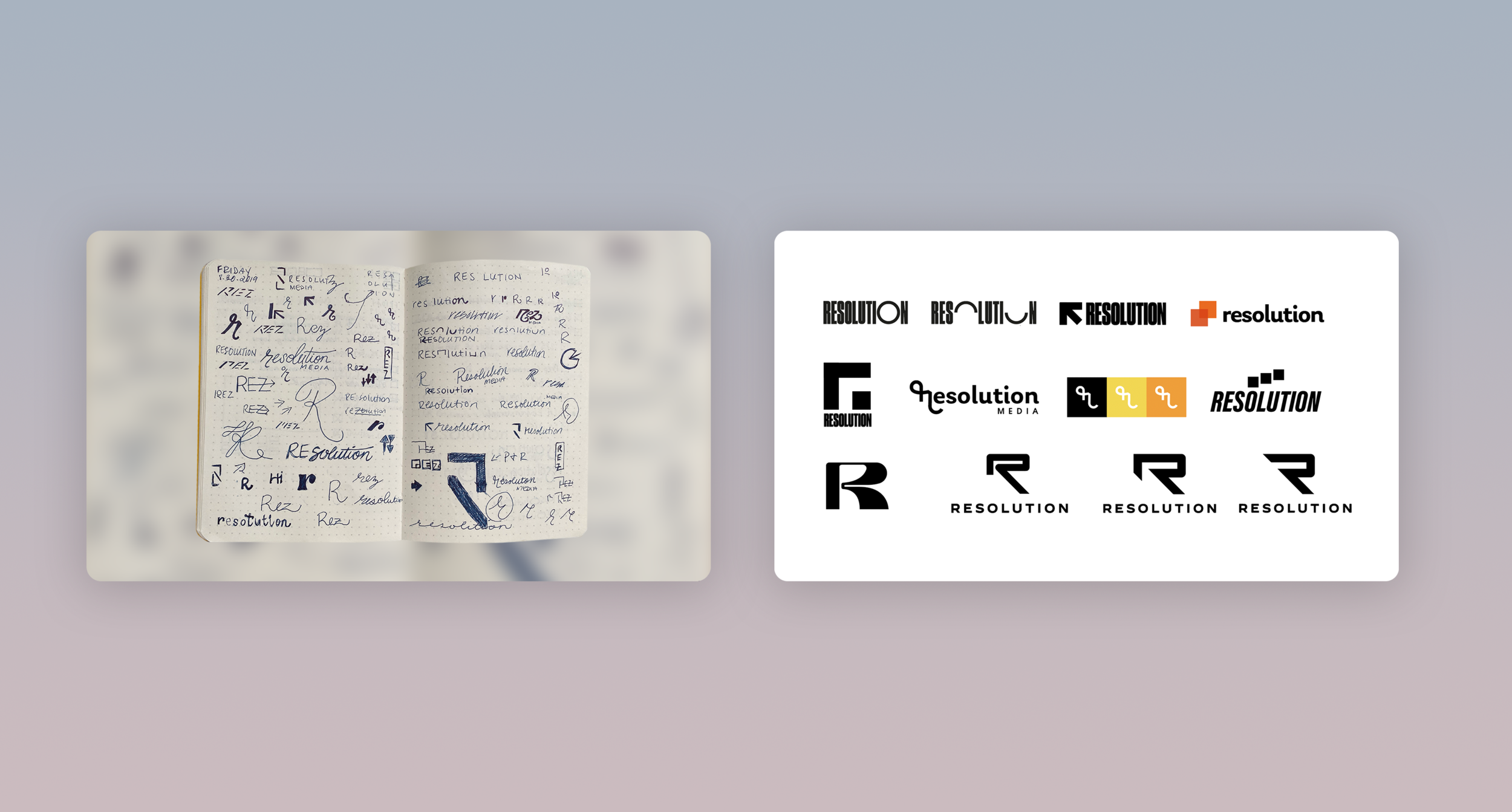
As I said, logos were being created in tandem with the systems, and this is only a handful of the logos that were sketched. As we continued to sketch, we started to notice things that were working and making sense within the larger systems we had created. We ultimately presented three logos to the client after testing many inside of the systems internally.
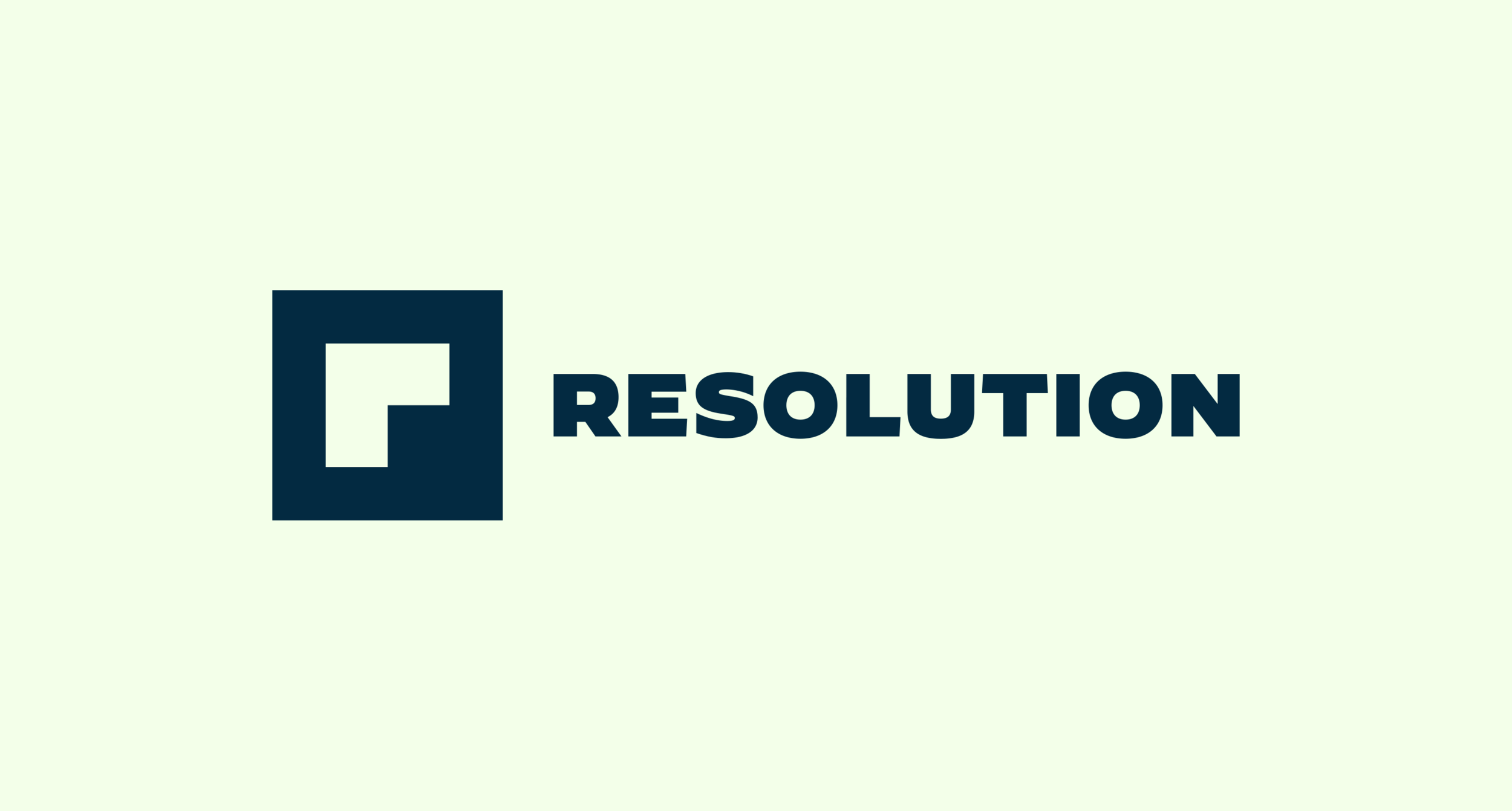
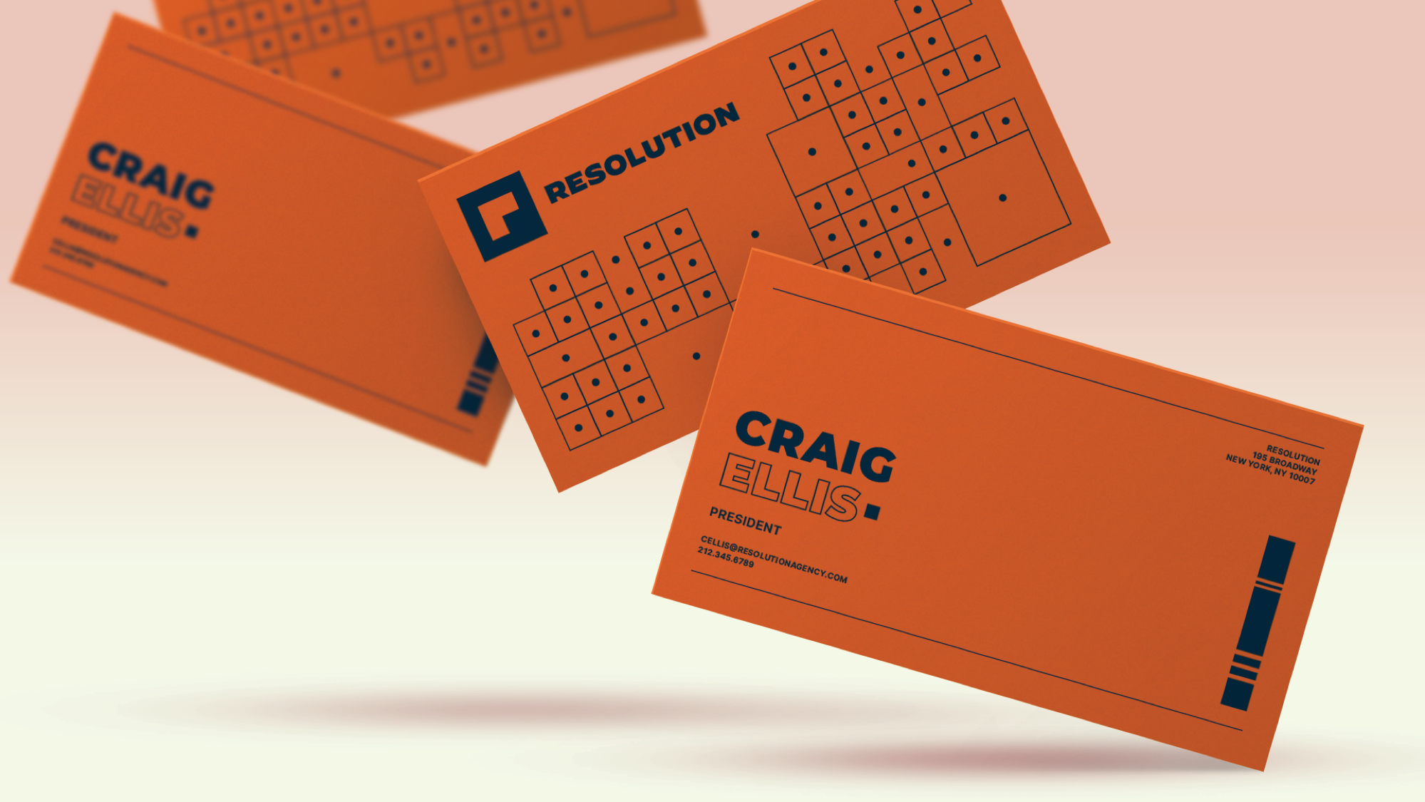
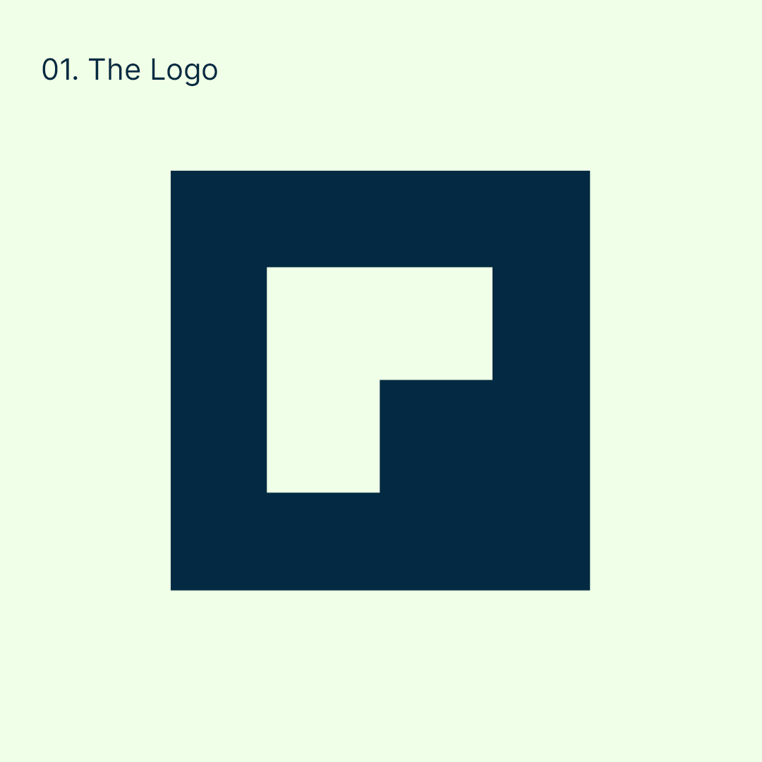
Resolution’s DNA is digital, and the logo needed to honor that legacy. The final design is based on the building block of the digital world – the pixel. Our goal was to create an exceedingly simple and recognizable mark that would represent Resolution in the fewest possible pixels.
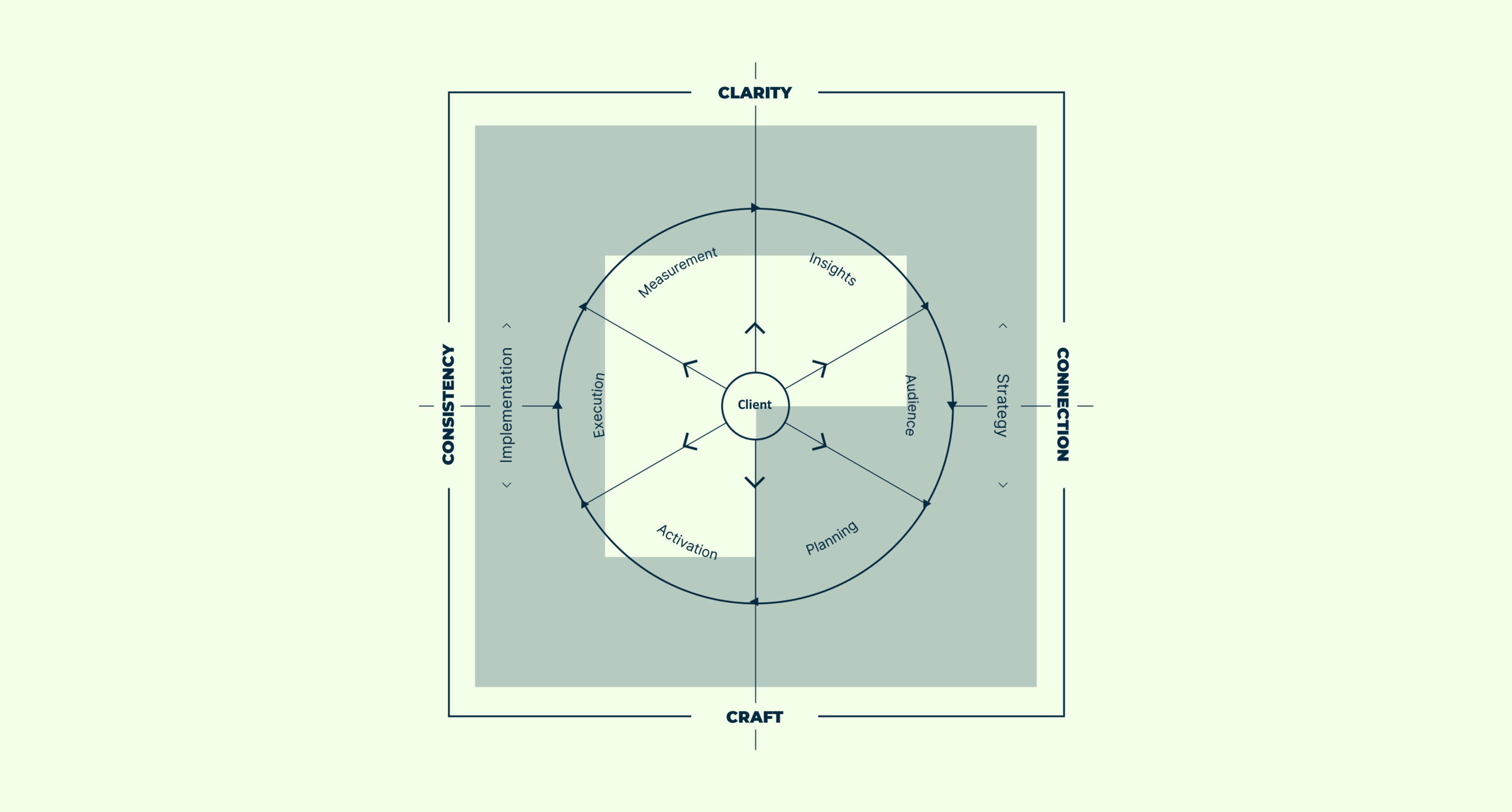
The Resolution “R” was created using four pixels, which mirrors the four quadrants / principles of the business approach, ensuring that the visual identity is as closely tied to the product as possible.
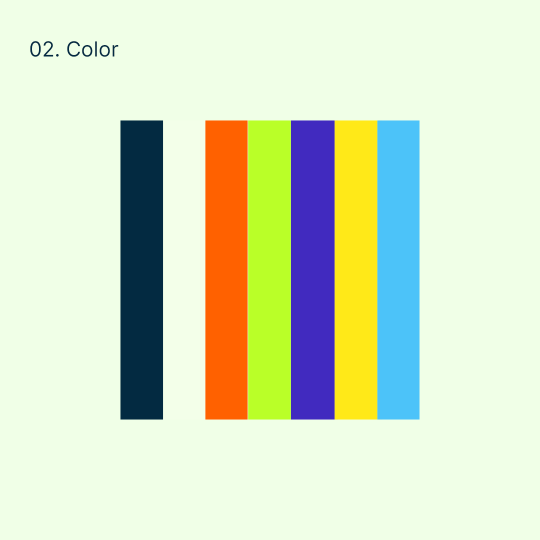
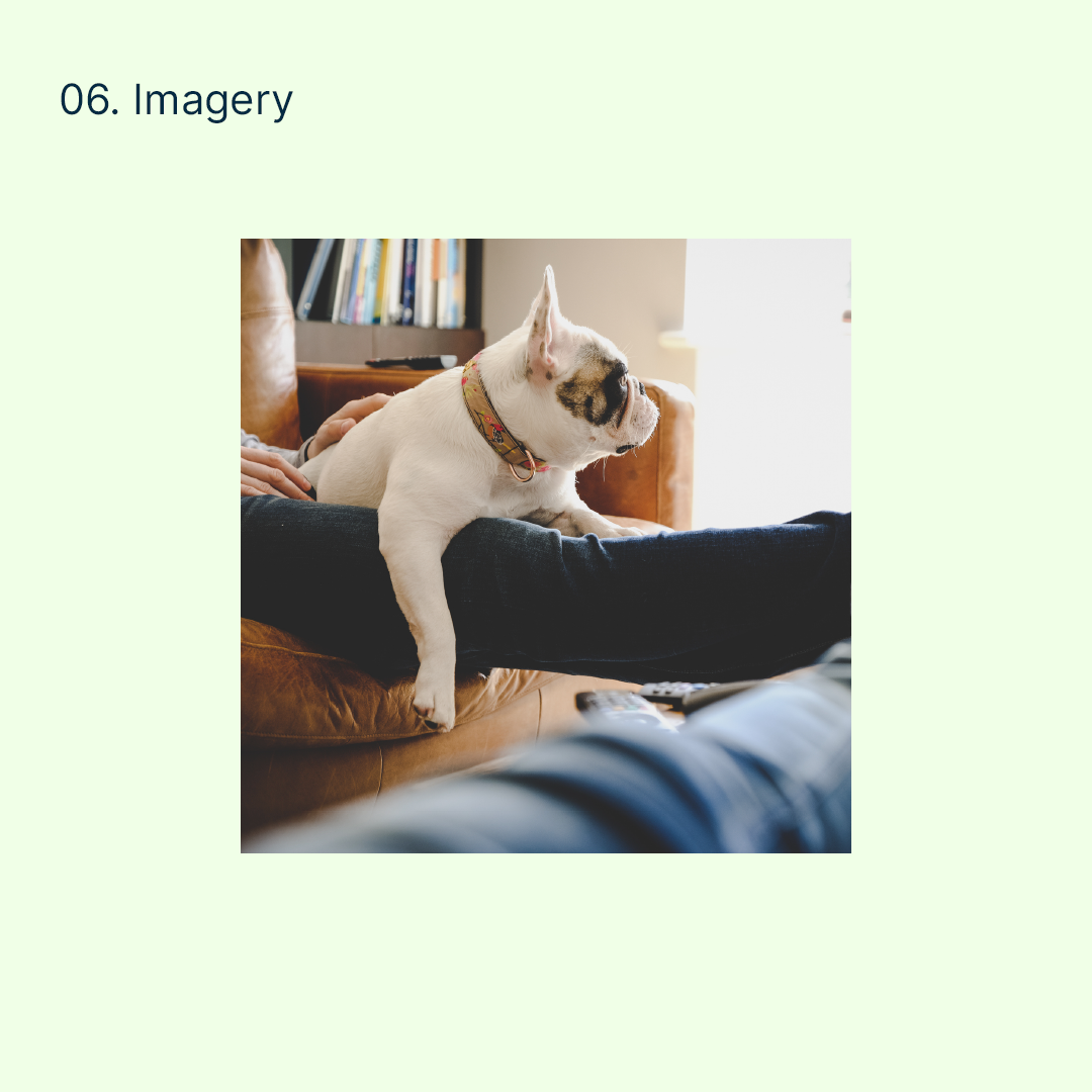
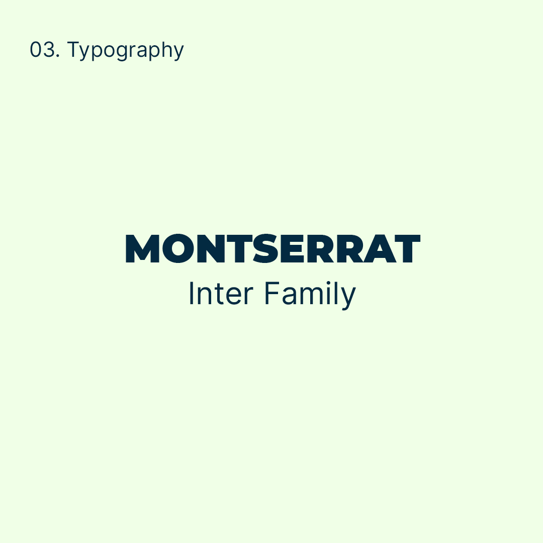
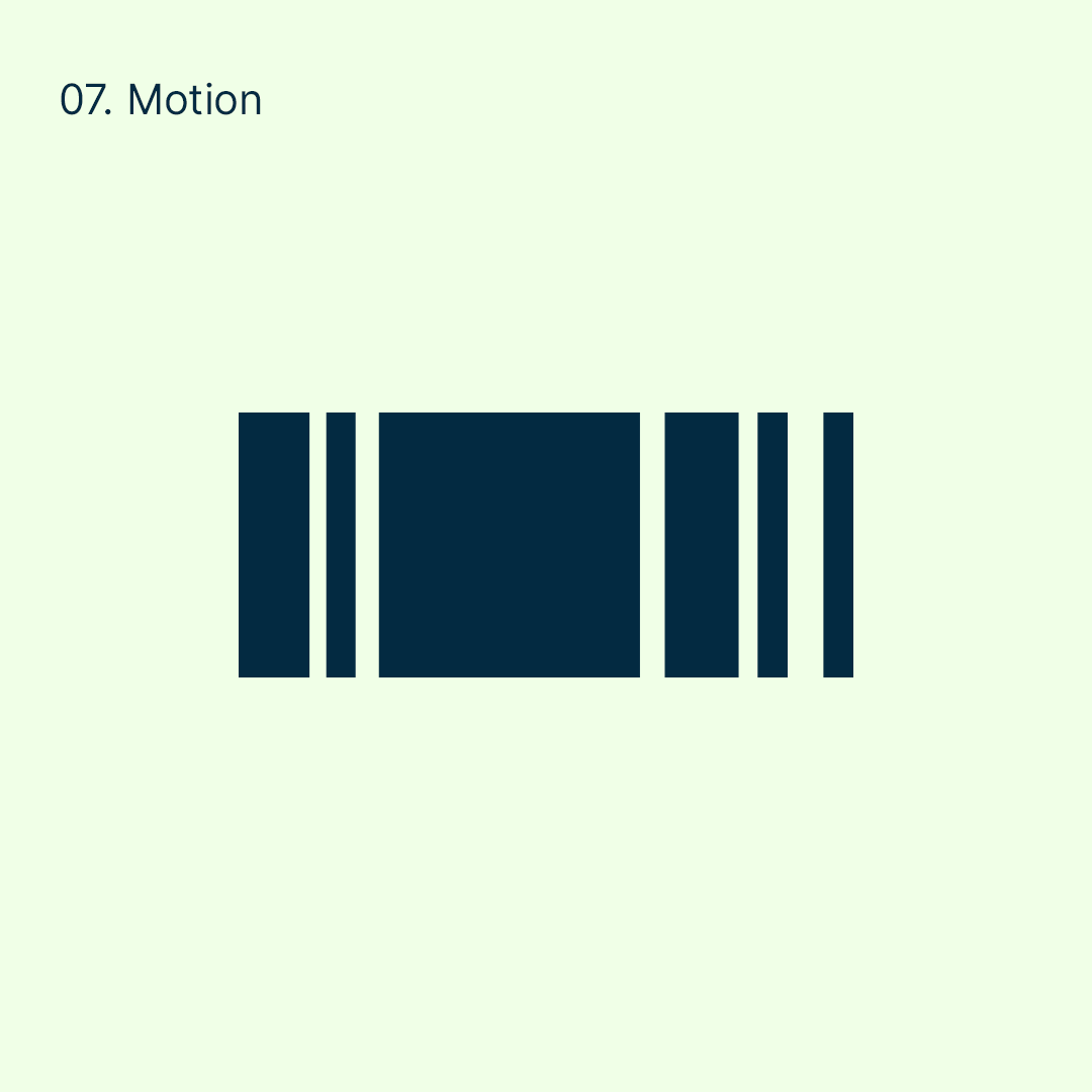
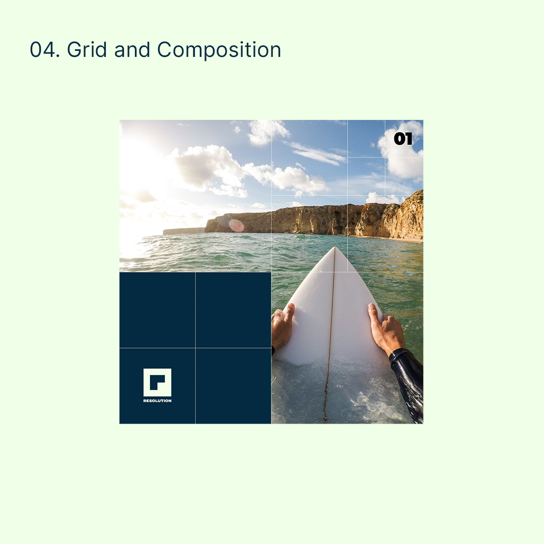
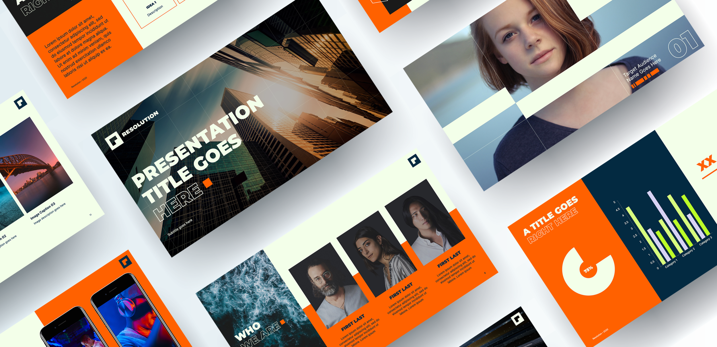
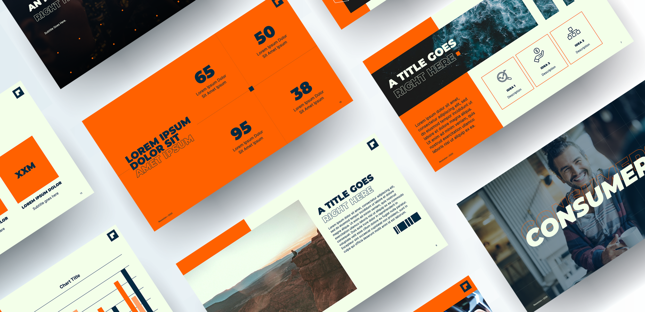
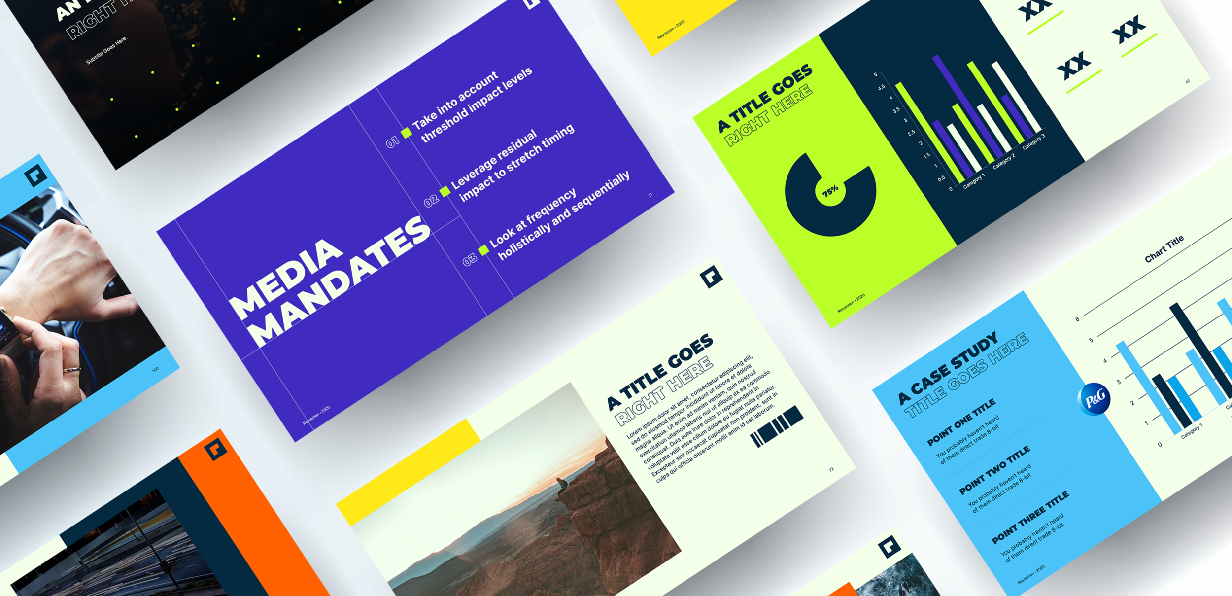
With the finalization of the logo, we were able to complete the set of visual system elements. All of the pieces were finally available to craft the brand as a whole.
05. Test and Launch Brand
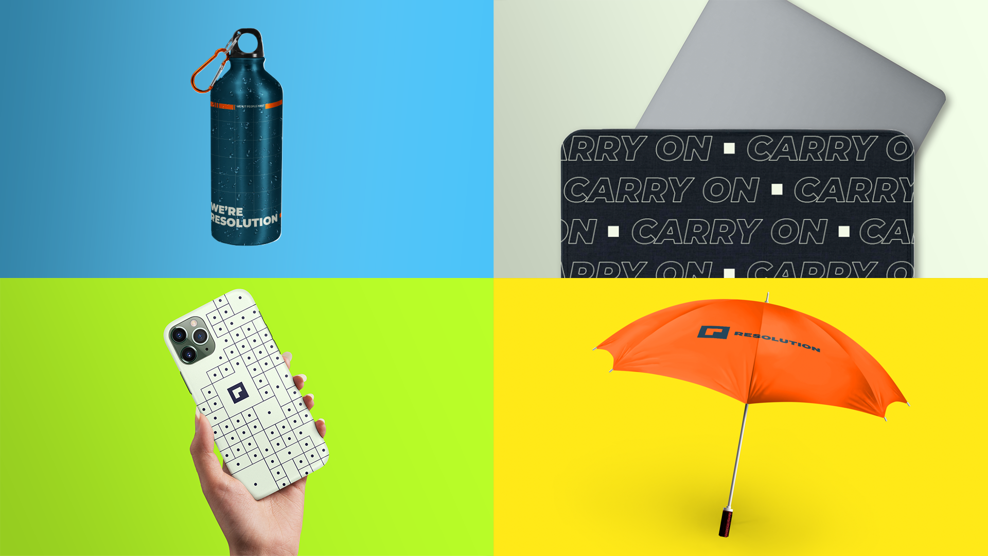
Now that the entire brand had been built, it was time to unveil everything to Resolution’s employees and the world. This was done through physical collateral, a launch party, and digital touch points such as web and social. Our goal was to gauge emotional and technical feedback of the brand from employees and clients.