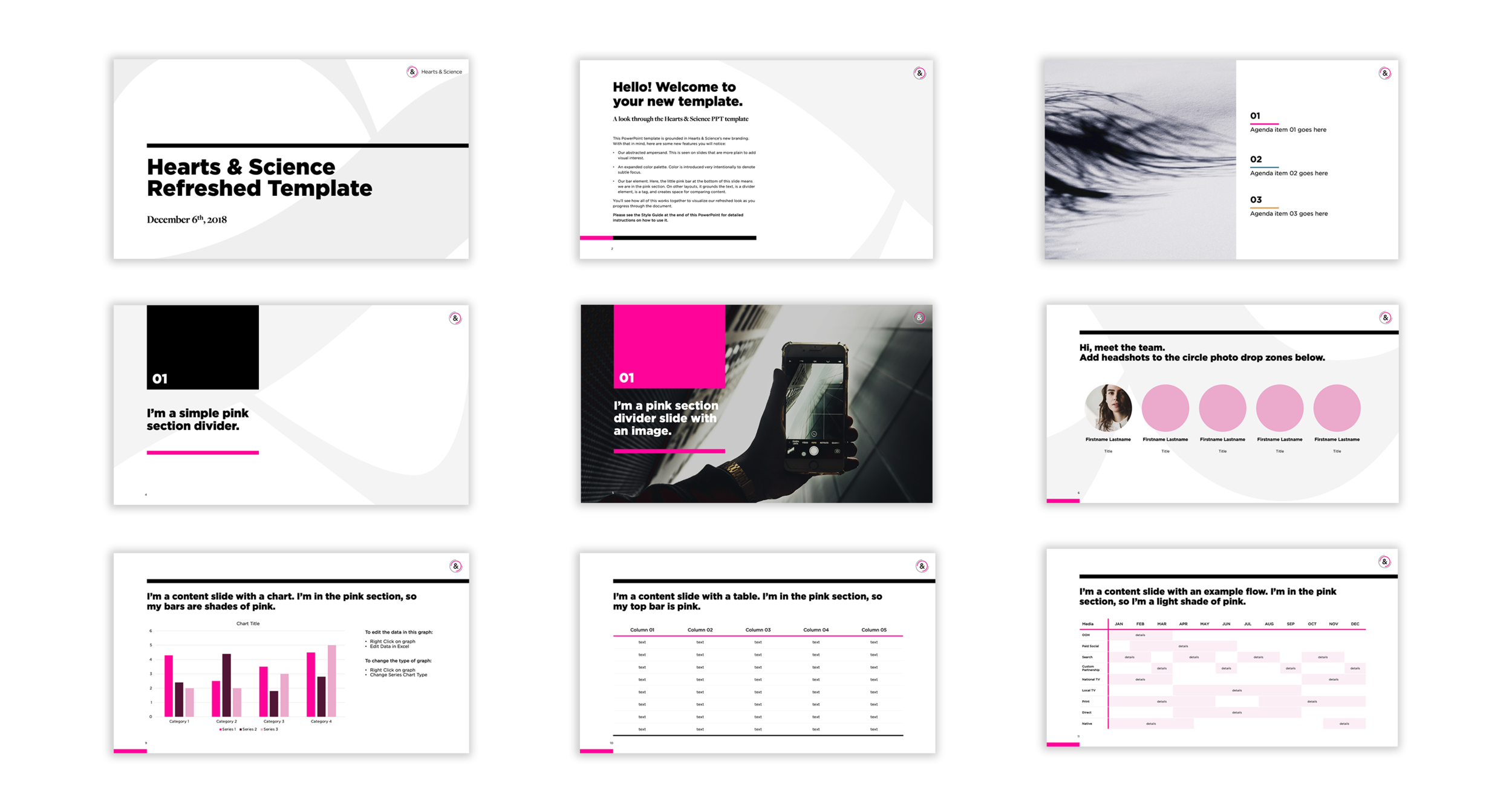
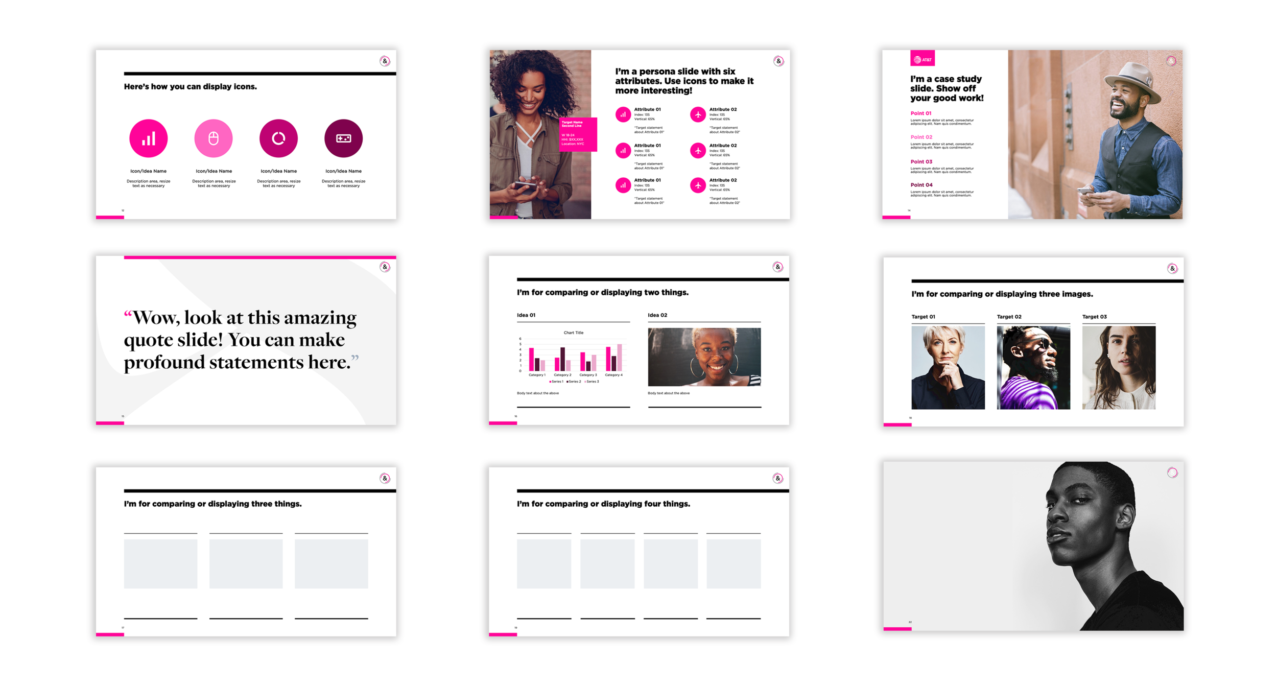
BRANDING + VISUAL IDENTITY
HEARTS & SCIENCE
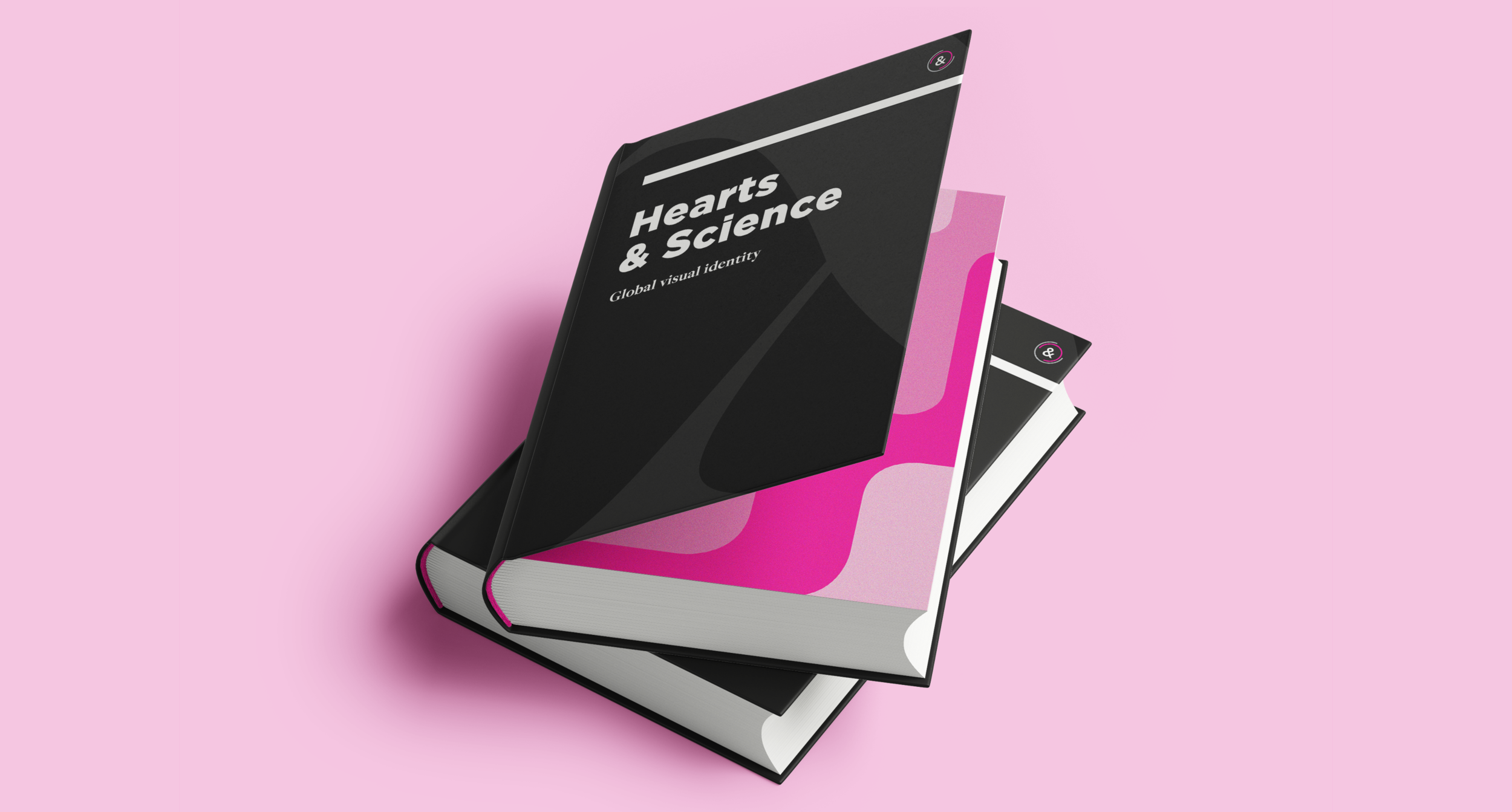
Hearts & Science is a global media agency within Omnicom Media Group. It was formed in 2016 as a response to a massive win for the group. Because of this, Hearts & Science’s branding was created over the short course of only six weeks. Having had an incredibly successful past few years, the agency decided to pursue a visual identity as smart, mature, and adaptable as it has become.
The Problem: A rushed identity.
The Solution: “We Are Shapeshifters” - a visual system based on the adaptability and rich history of the ampersand.
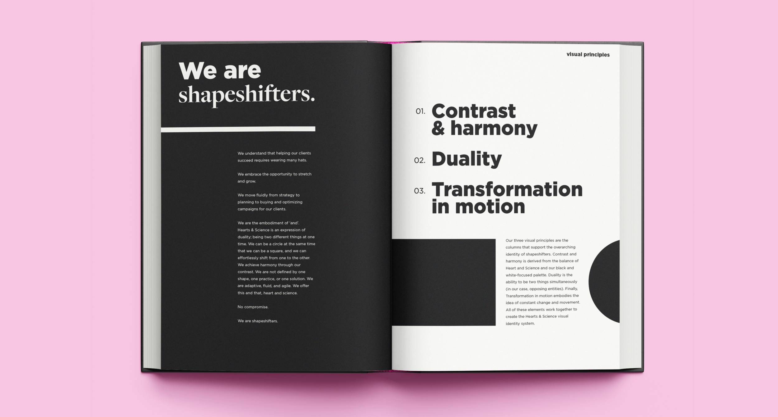
The Visual Identity Core
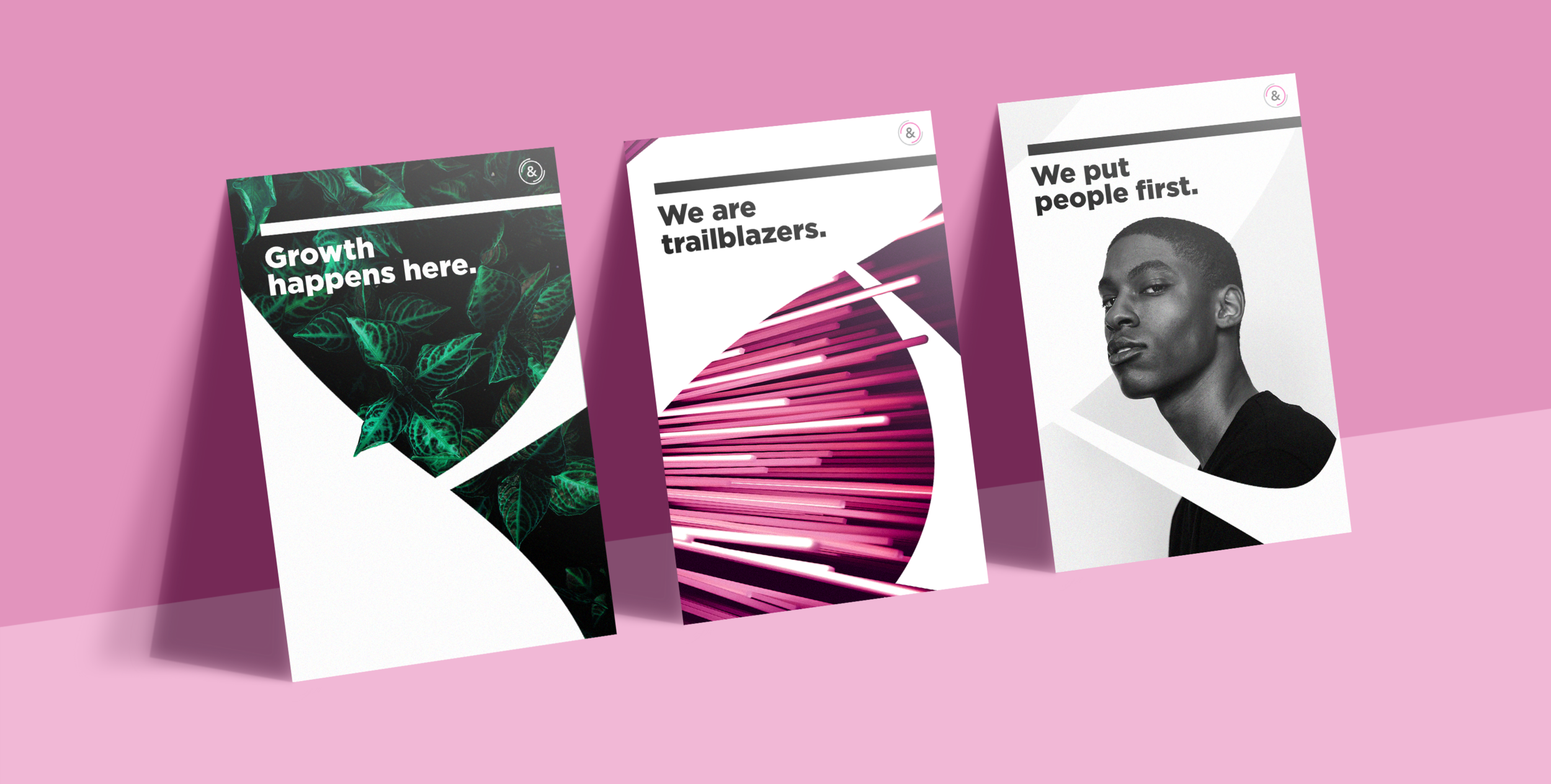
My research led to a visual identity goldmine embedded in one of the Hearts & Science core values: We are Shapeshifters. This value became the entire foundation for the new identity system. This concept is supported by three distinct visual principles: Contrast & Harmony, Duality, and Transformation in Motion.

The Ultimate Shapeshifter
The ampersand is the centerpiece of the Hearts & Science logo mark, making it integral to the brand. Therefore, it made sense to use the newly introduced Freight typeface’s ampersand as a core visual device in representing the shapeshifting narrative. It visually and historically represents everything the brand is. It’s a connecter of two things. It’s a fluid form that has undergone myriad transformations over its long lifetime. It is a shapeshifter.
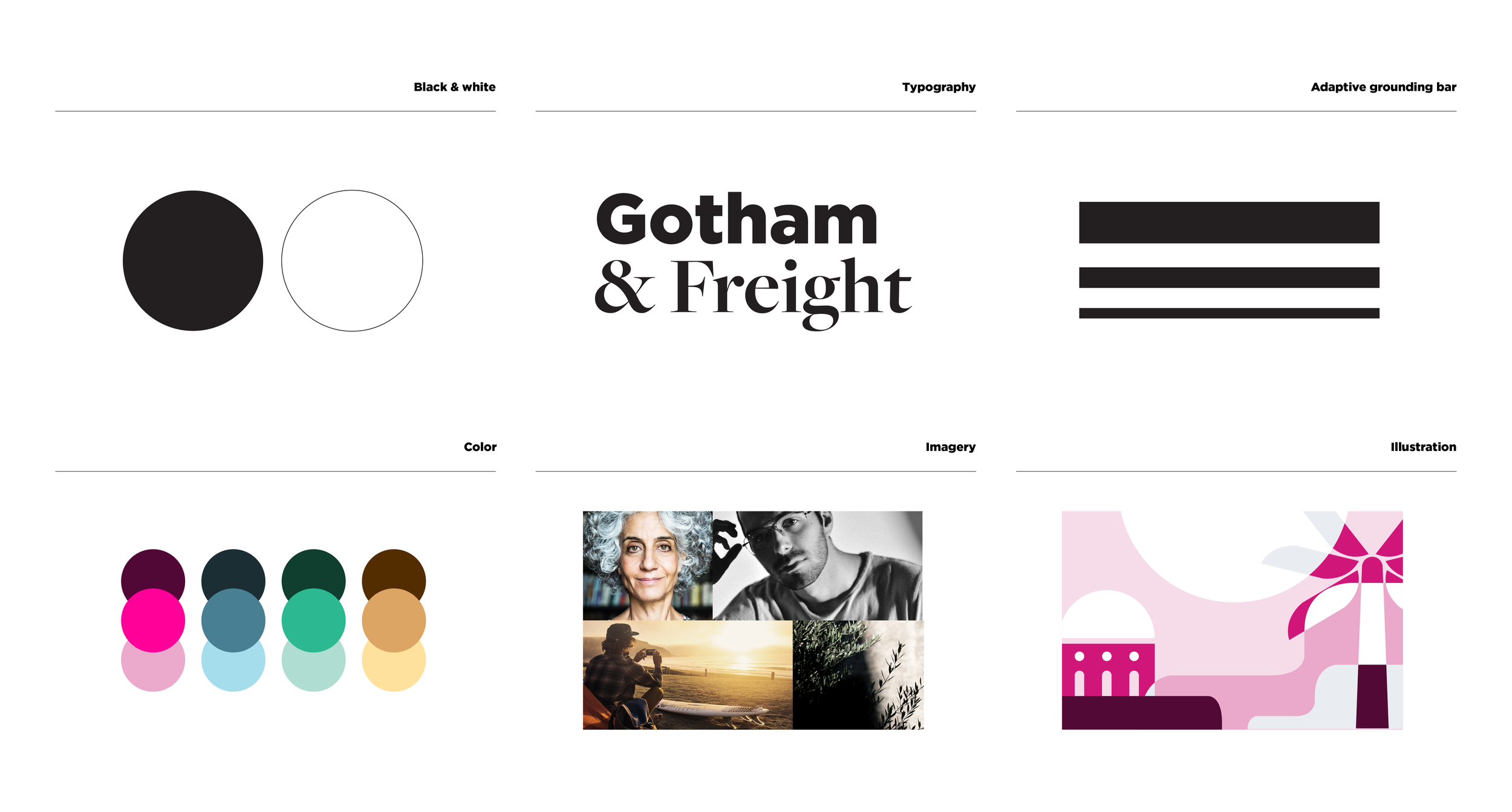
Giving Life to the Visual Principles
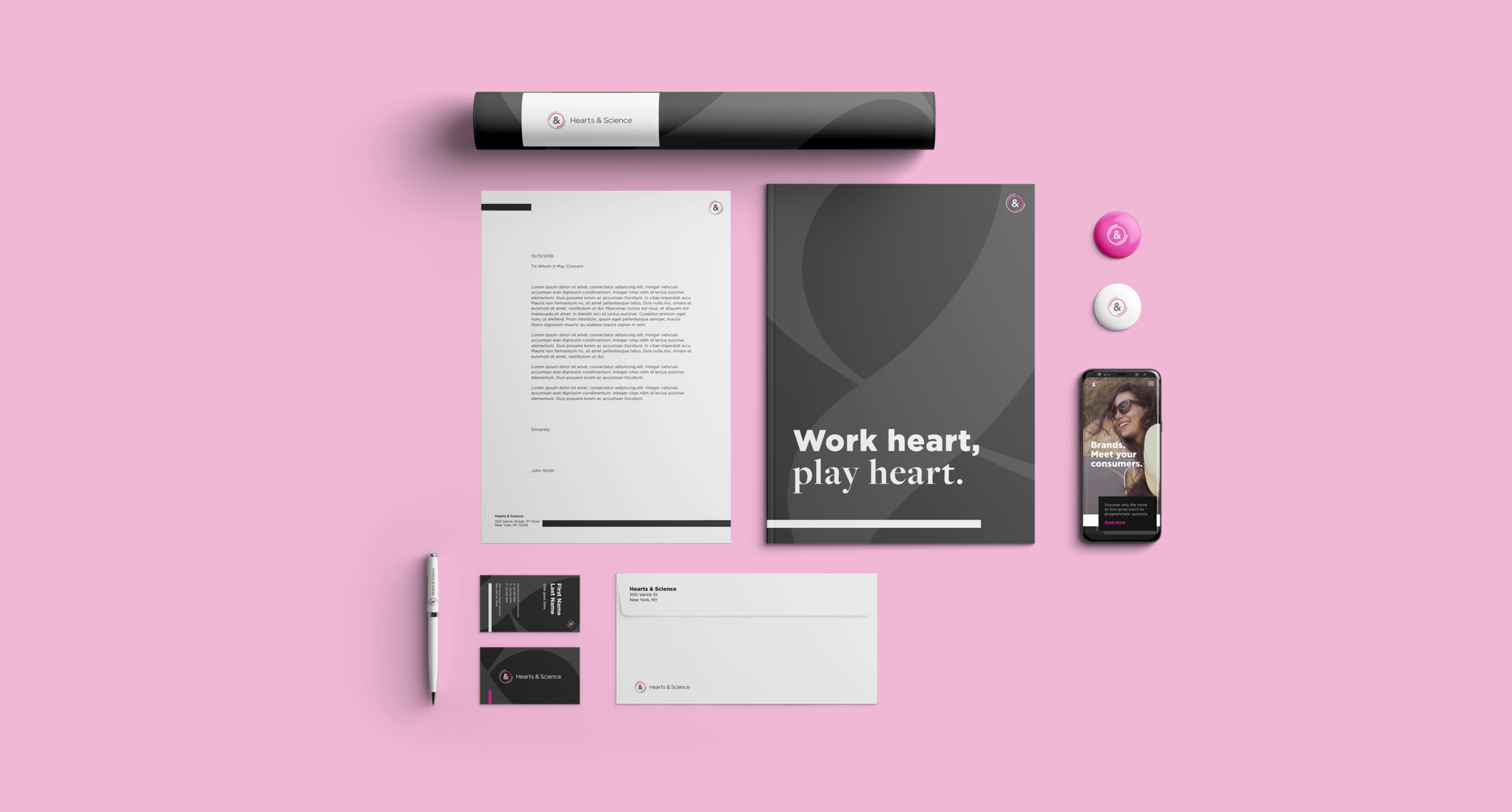
The visual principles, contrast & harmony, duality, and transformation in motion are expressed in the six practical elements above. When employed together, they aid the ampersand in expressing the concept of shapeshifting.
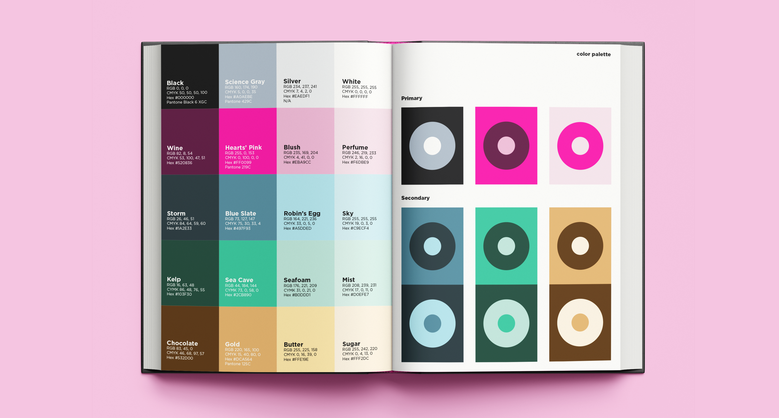
Contrast & Harmony: Color
Hearts & Science rested on its three primary colors, Hearts Pink, Science Gray, and Blue Black, for a long time. The palette was evolved, changing Blue Black to True Black for a sense of maturity and edge. The focus of the palette shifted from mainly Pink to mainly Black and White to express high contrast. Additionally, two new colors, Blue Slate and Sea Cave and their shades/tones, were added to the secondary palette to allow for more flexibility in expressing the brand’s personality and to aid in brand organization.

Contrast & Harmony: Imagery
Imagery was the most difficult element to get right. Ultimately, photos that play with light and shadow, contrast in color and context, and geometry in nature were chosen. The idea is to capture the idea of Heart and Science in any one photo. For example, the man sitting in nature bathing in the sunlight is the heart, the tablet in his hand is the science (bottom center).
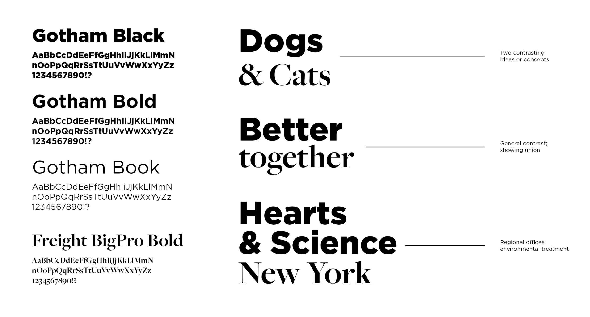
Duality: Typography
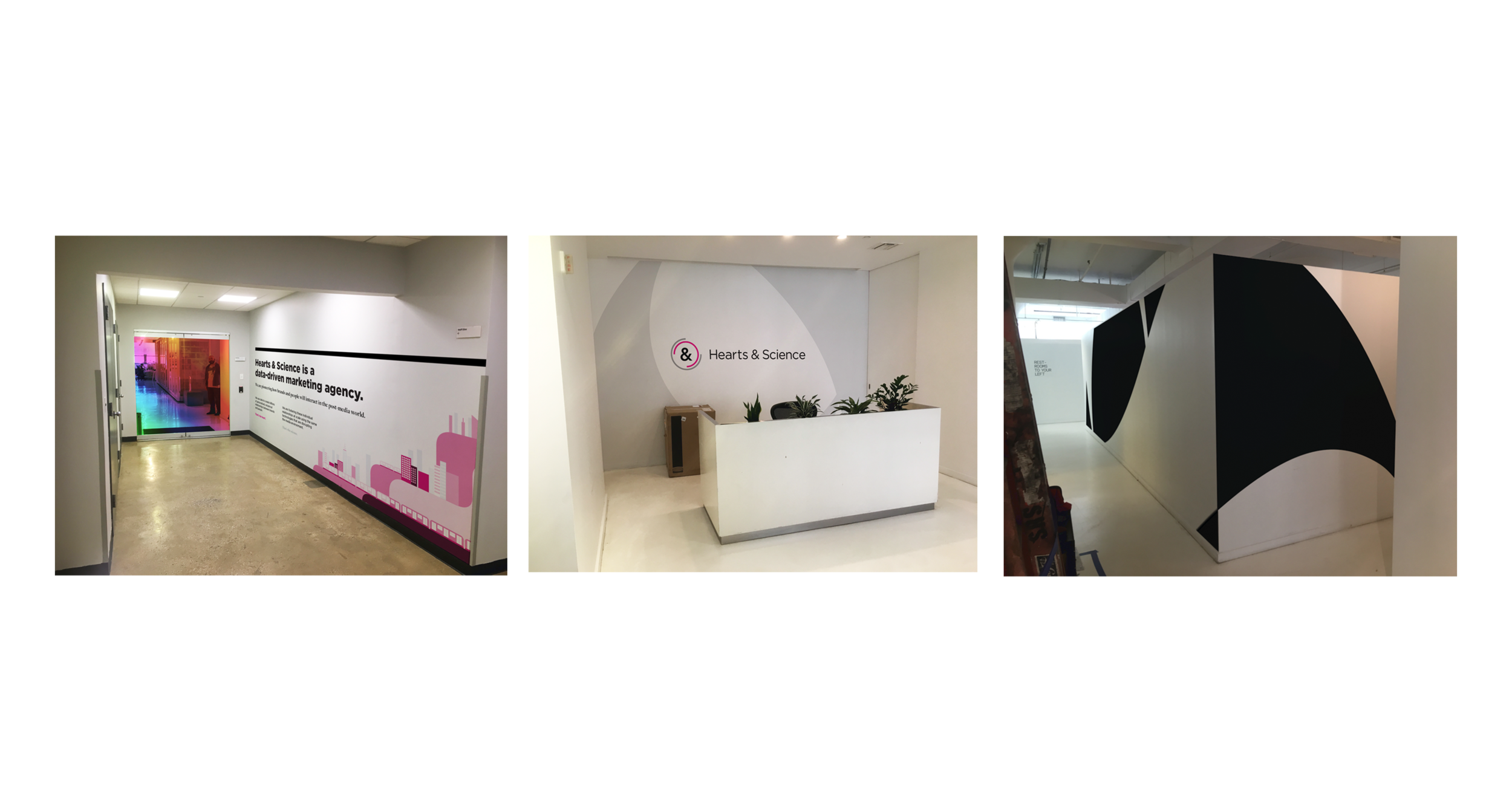
While there is contrast & harmony in our typography, its main purpose is to communicate duality through the use of two different typefaces, Gotham and Freight. Gotham and Freight’s pairing is used intentionally to express to contrasting ideas, union, and as an environmental element in regional offices.
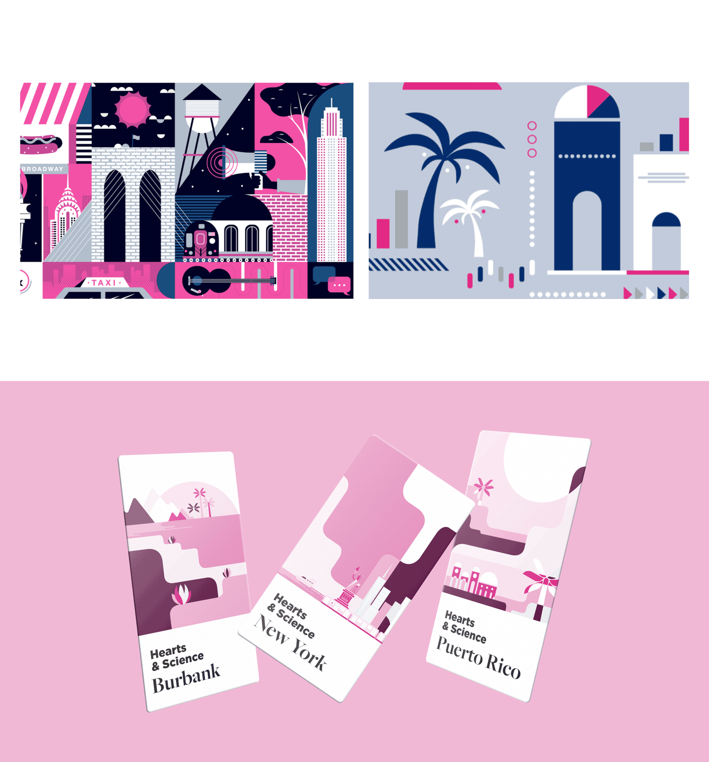
Transformation in Motion: Illustration
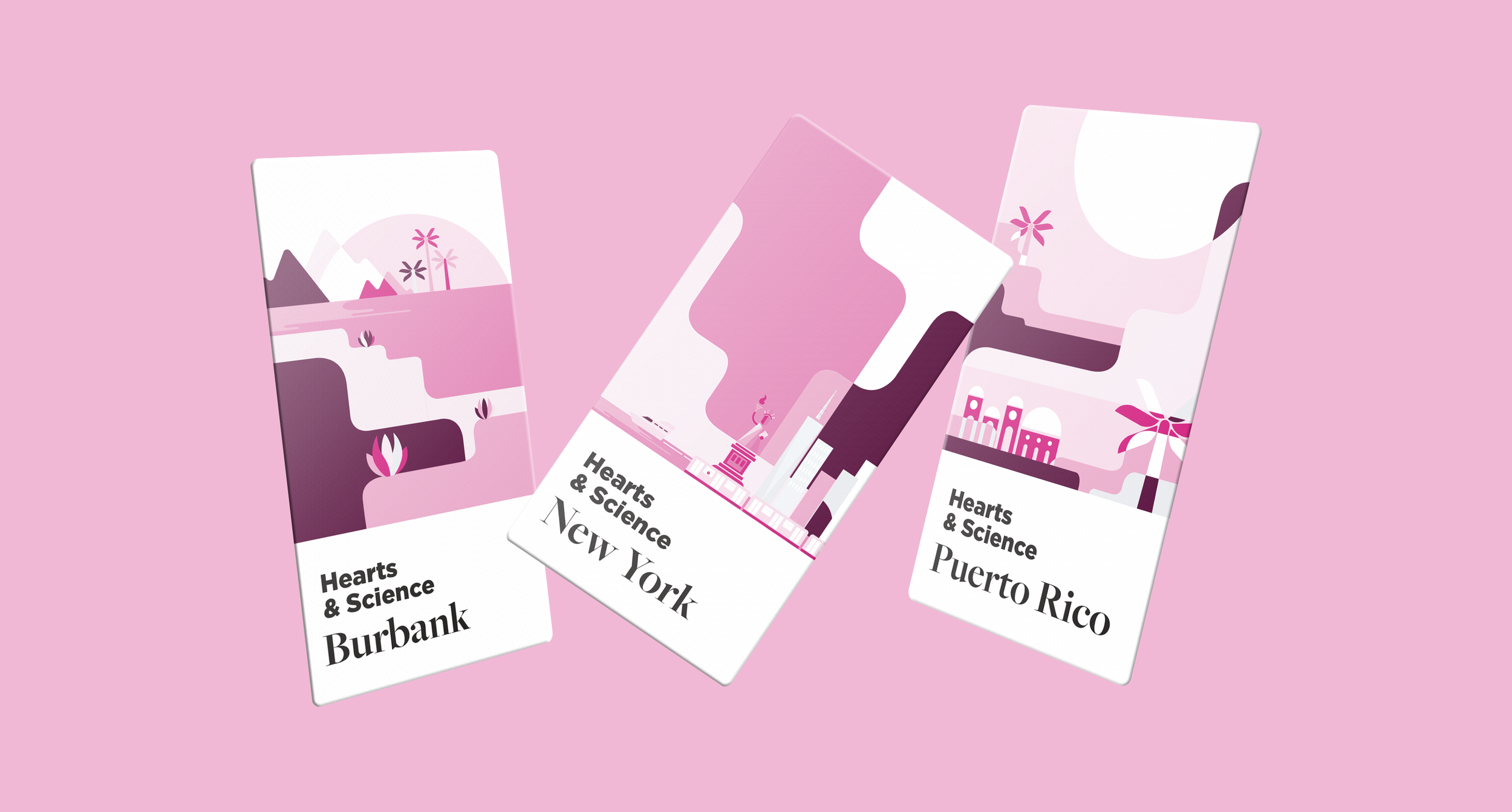
Illustration was such a key element of the Hearts & Science brand prior to the refresh, I knew that it had to be maintained, but elevated. The approach was to curate and simplify. I took the good parts and put them into a style and environment that highlights the key elements and evokes a sense of movement and transformation. This is accomplished through a monochromatic palette, soft geometry, and color change at overlapping points. (Frame 1 = Old Style, Frame 2 = Updated Style)
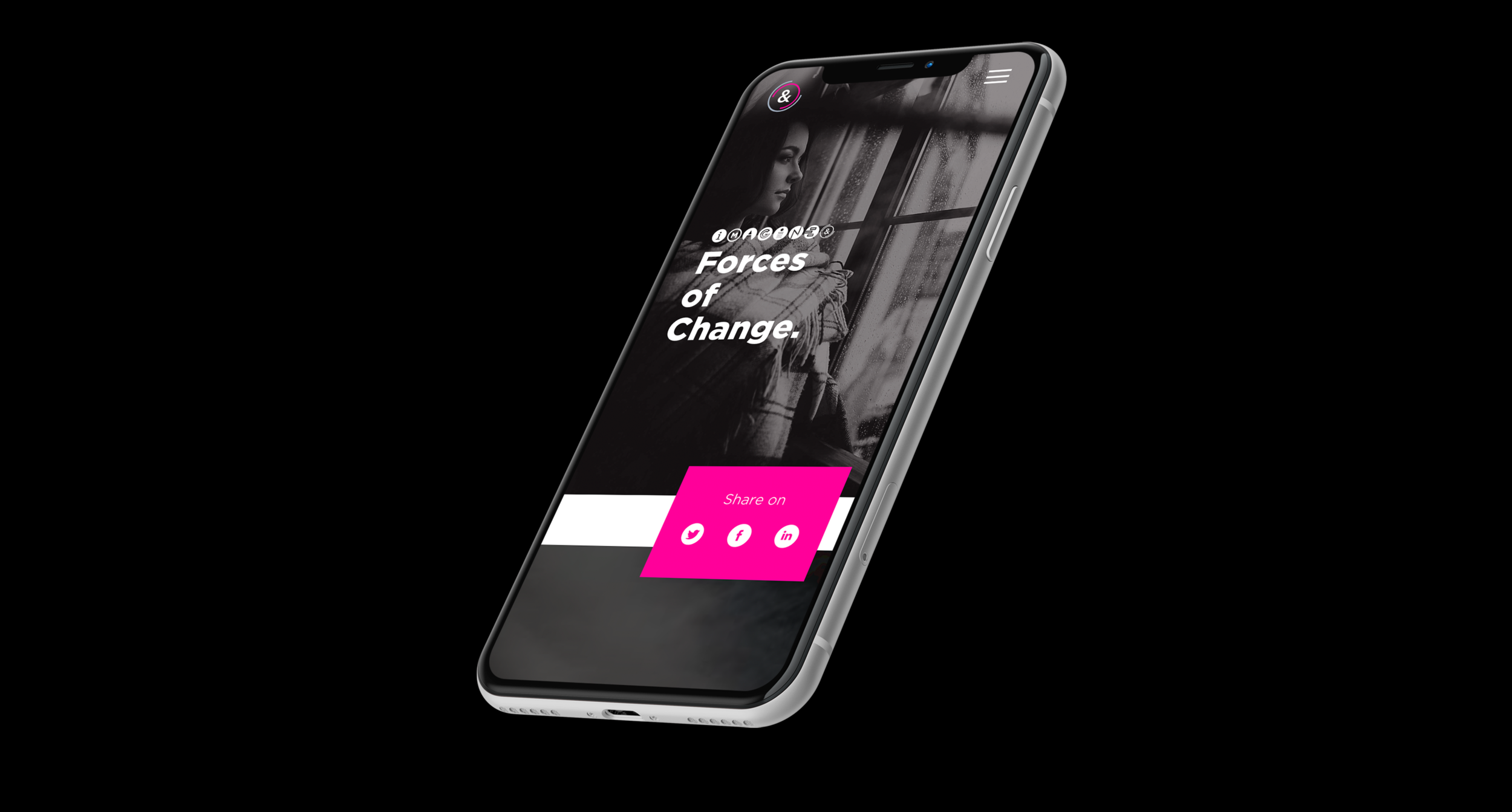
Forces of Change Site Design
Hearts & Science has a thought leadership practice called Imagine. Their recent report centered around Forces of Change. I had the opportunity of designing the blog from the ground up and employing an outside vendor to code and bring it to life with my creative direction.
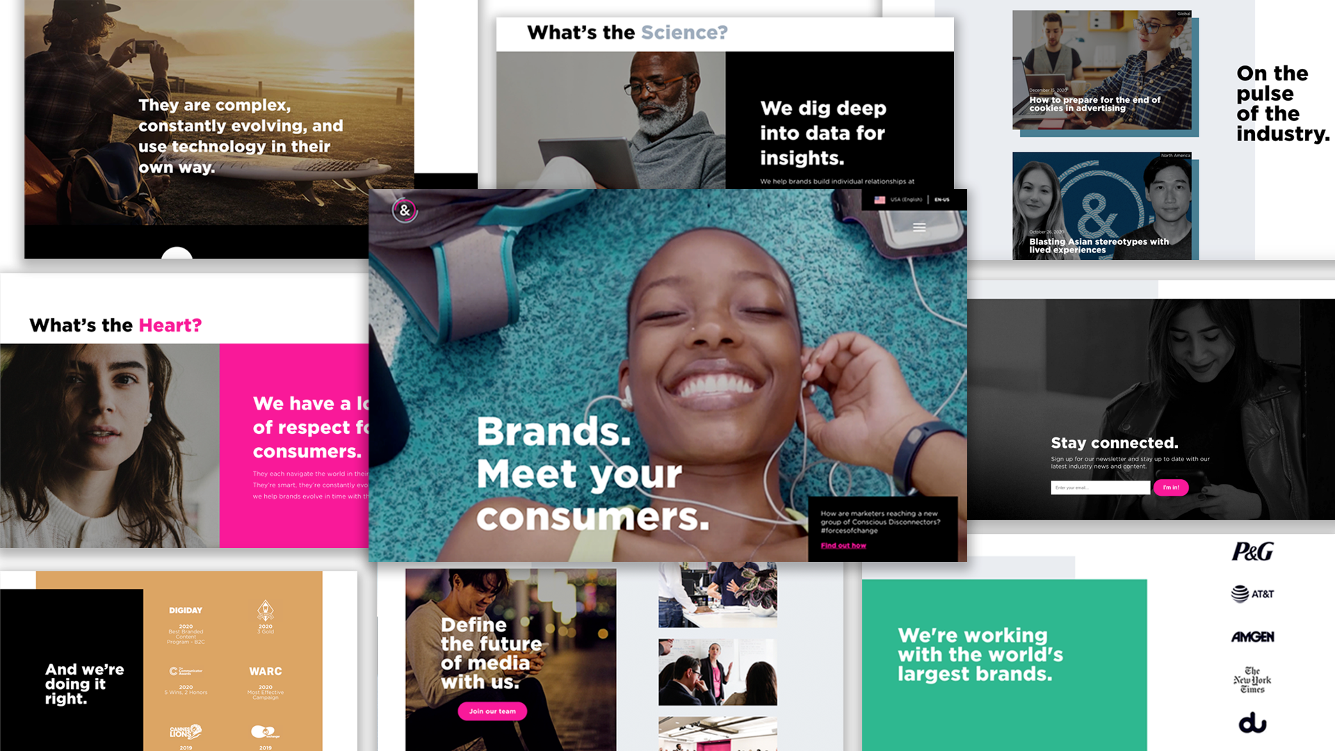
Hearts & Science Site Design
I led the creative direction of the main Hearts & Science website, which was deployed across all of their markets globally.
One of the main components of the design was the way that motion played into the brand. If you’re curious, check it out here