BRANDING + VISUAL IDENTITY
PIVOT SPRINT
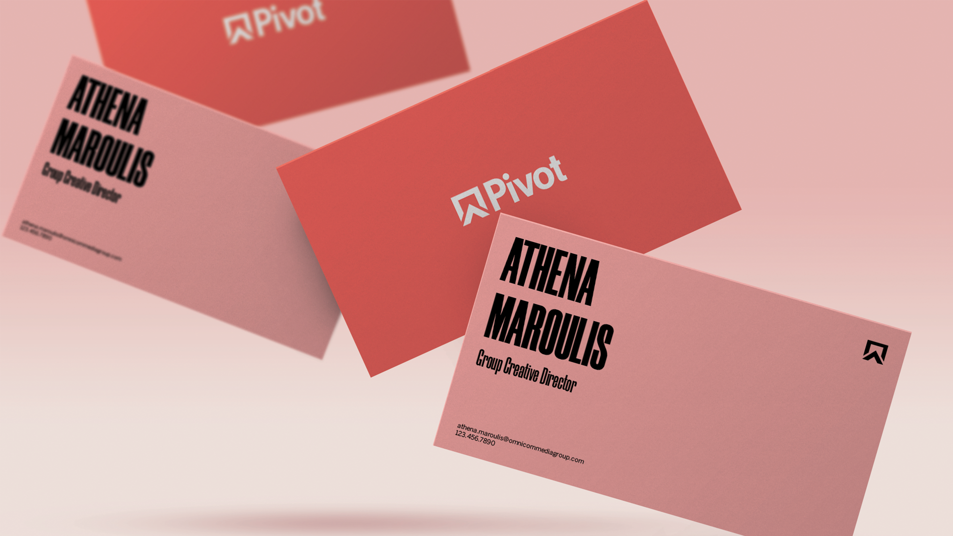
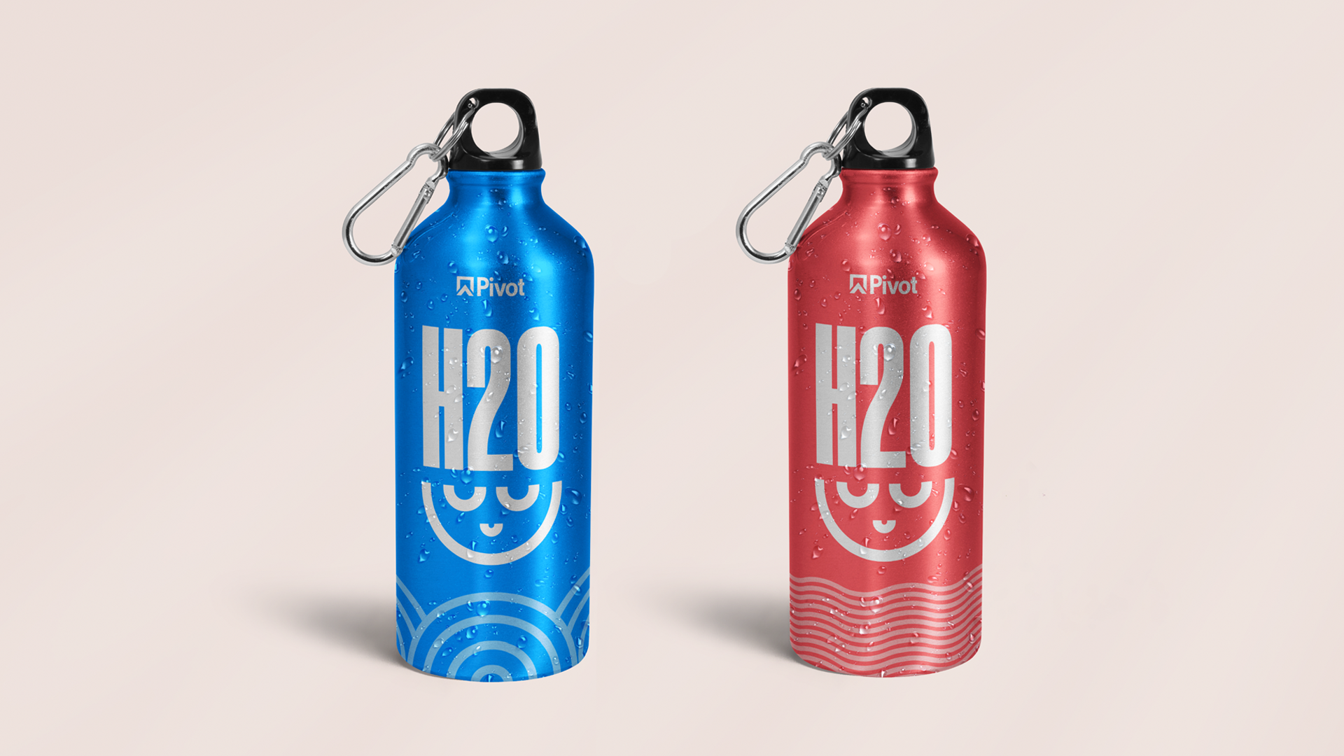
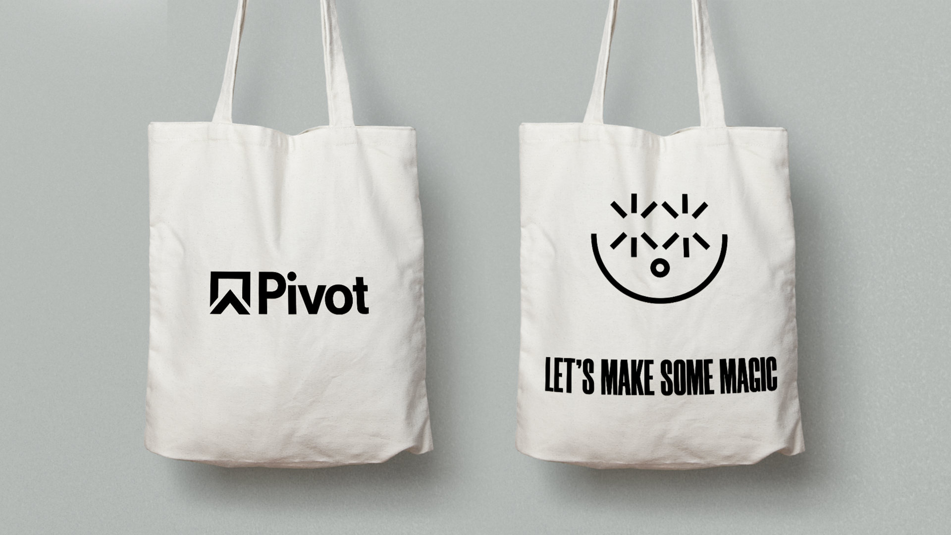
Pivot, of which I was a member, is the internal creative team at Omnicom Media Group. We were tasked with rapidly developing a visual identity in one day for ourselves as our team has grew a lot over the past two years. This is how I interpreted our brand.
The Problem: Growing and gaining recognition with no identity other than a logo.
The Solution: “Let’s Have Fun” - a visual system based on the diverse cast of characters that make up our team. It’s all about bringing a smile to people’s faces.
System Elements
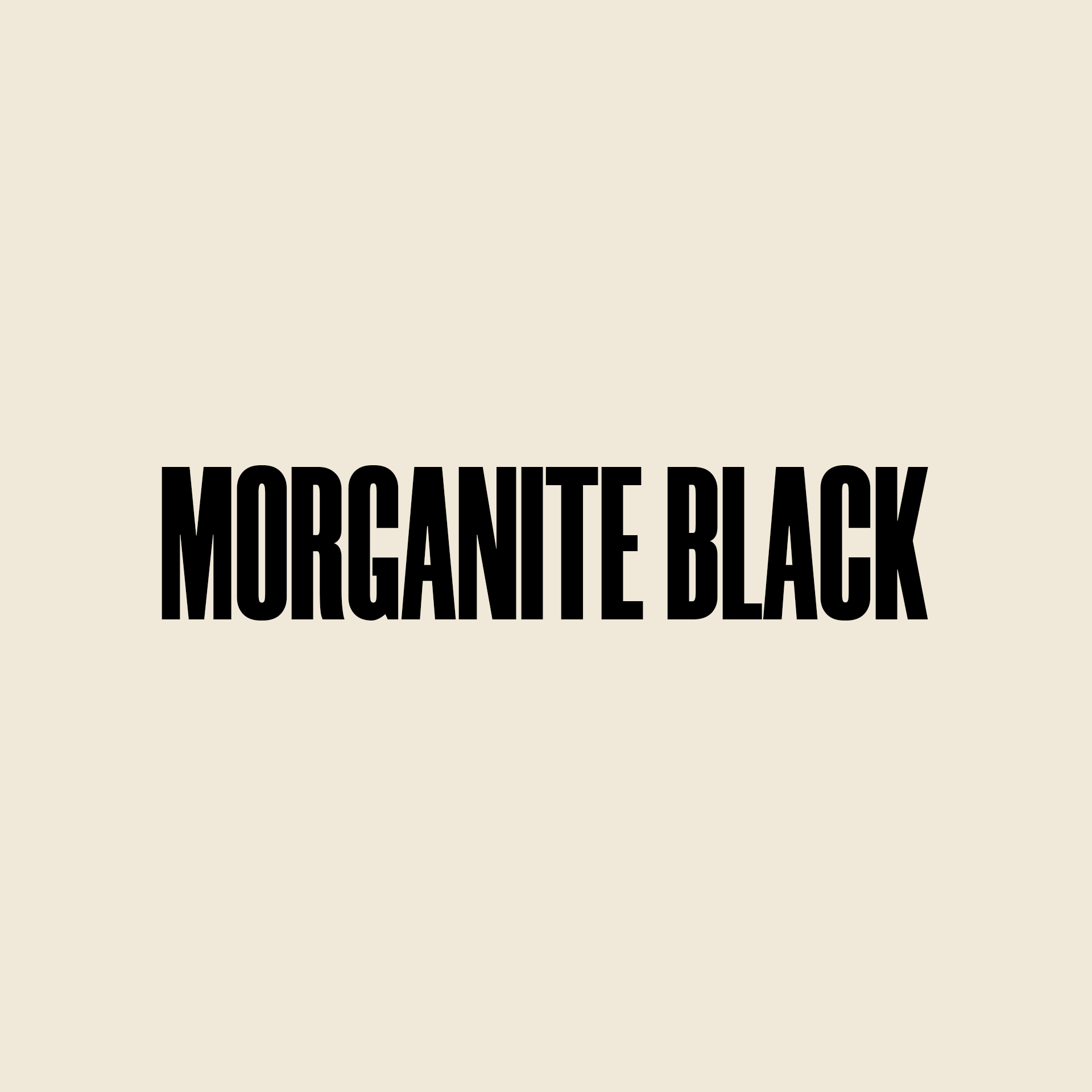
Typography
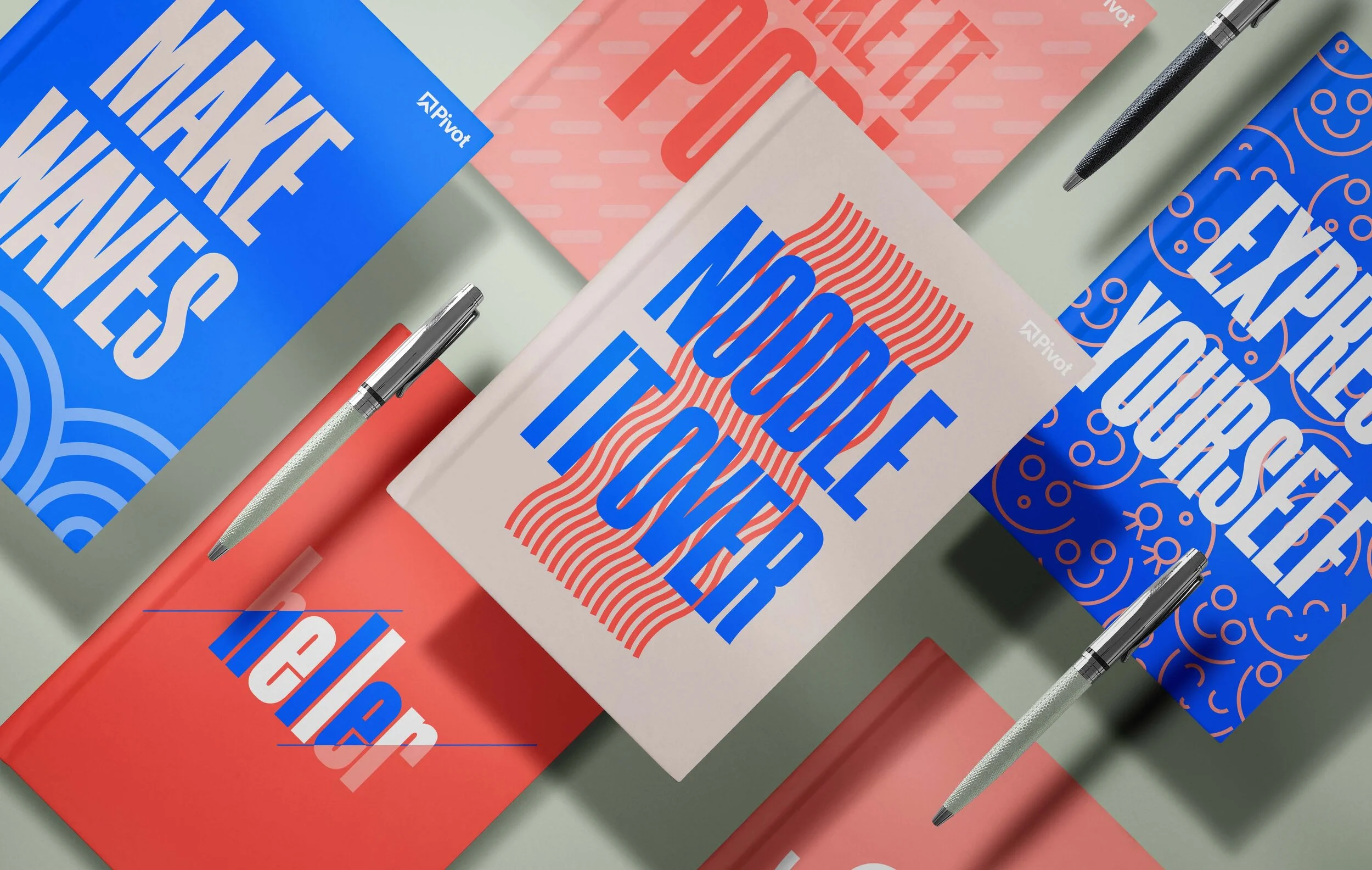
Using unique and bold typography gives simple layouts a big personality, like all the members of this team.
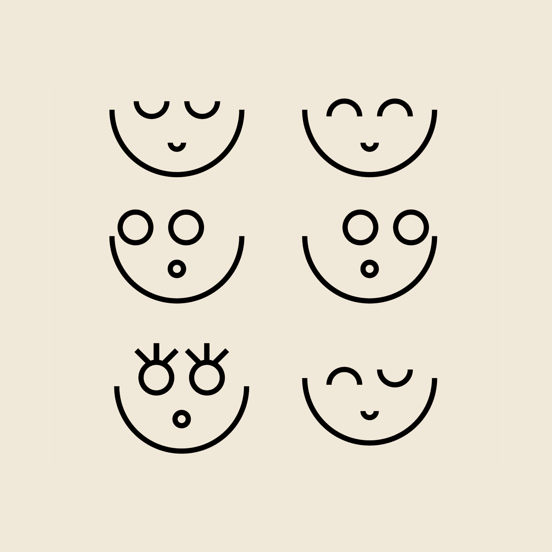
Characters
Expressive illustrations create a sense of fun, lightness and personality.. They also reflect the goofiness team.
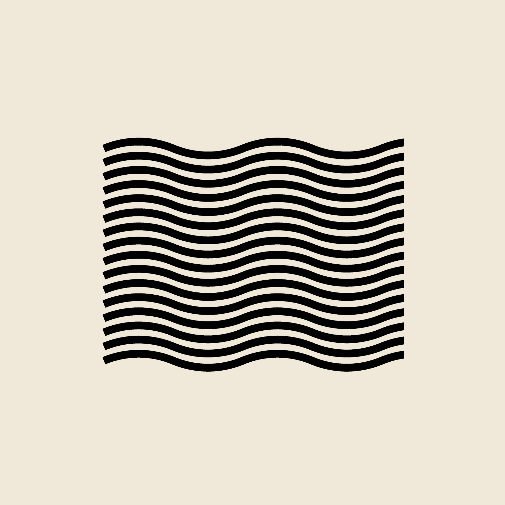
Whimsey
We are fun people! Our brand should feel fun, too - through graphic elements and through messaging.
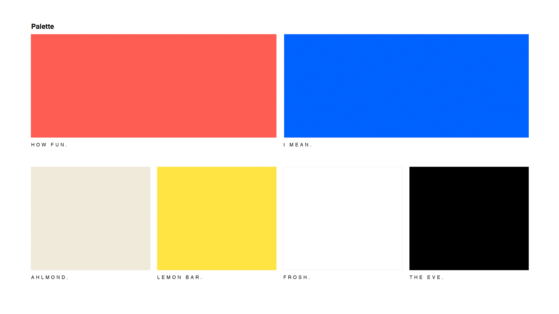
The Palette
The colors were chosen for their vibrancy and high contrast, and they were named after some silly inside jokes between members of the team.