DIGITAL/PRESENTATION DESIGN
OMNICOM TEMPLATES
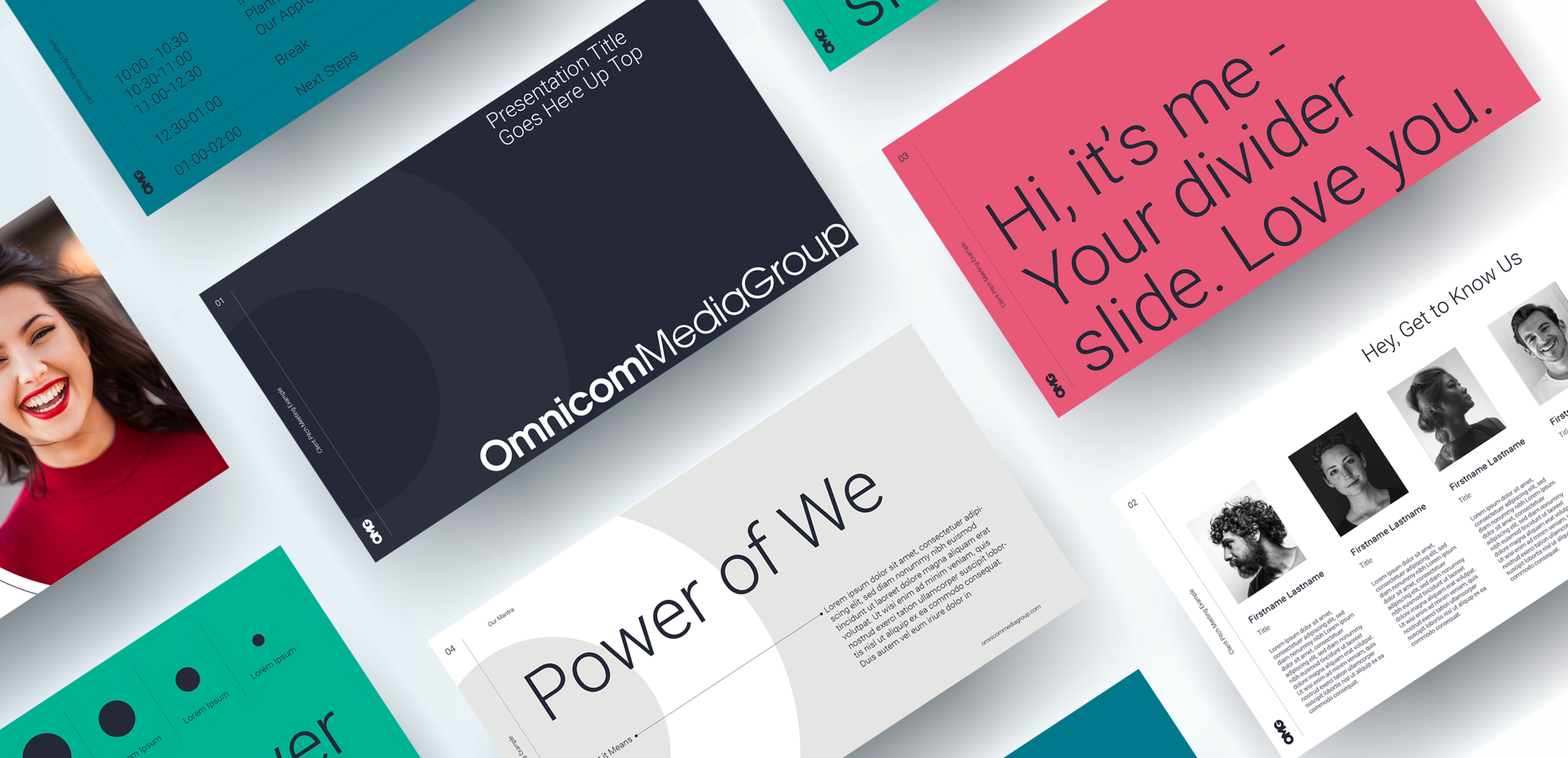
In a time when face-to-face communication is not an option, our digital storytelling and communication must be as fresh and compelling as possible. Additionally, any communication is an opportunity to spread some love and joy during this time.
The Problem: A dated, corporate presentation template.
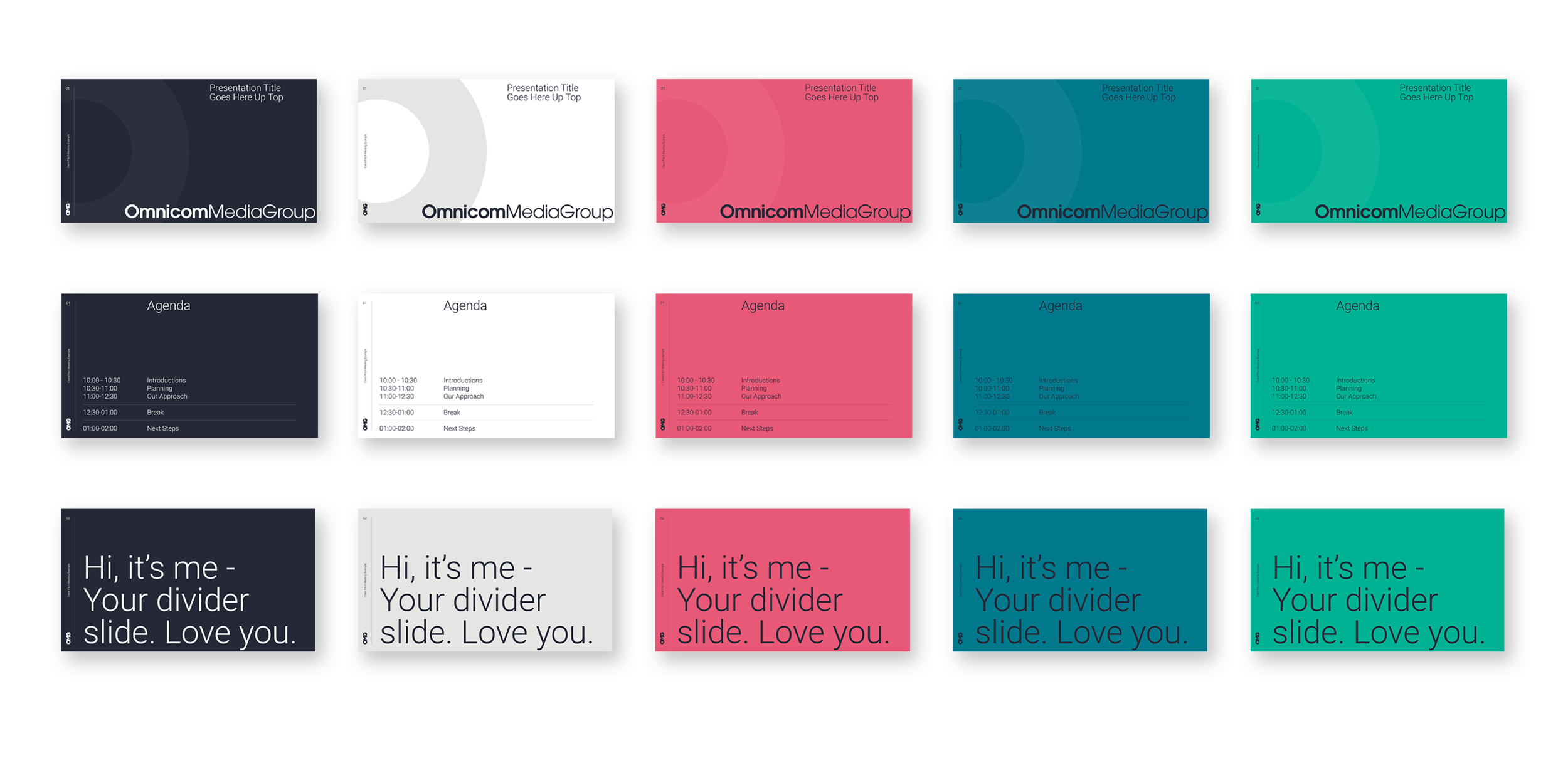
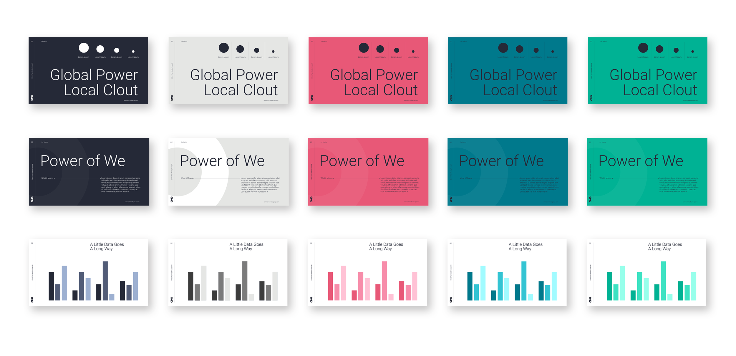
The Solution: “Simple, With Love” - a presentation identity that abandons standard alignment/structure rules, drops unnecessary graphic fluff, and ushers Omnicom Media Group’s secondary palette to the forefront, all in the hopes of simplifying communication and delivering some joy.
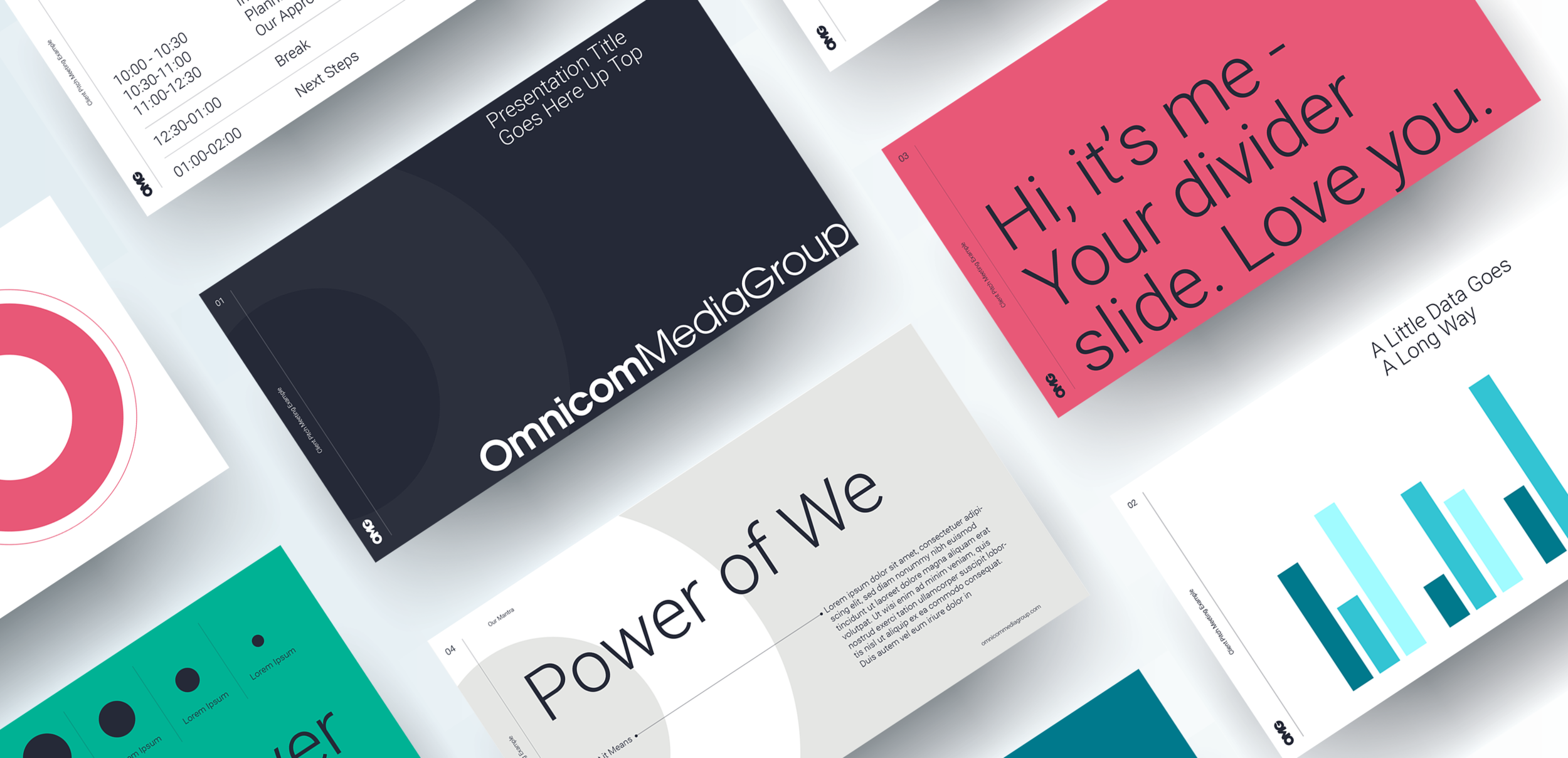
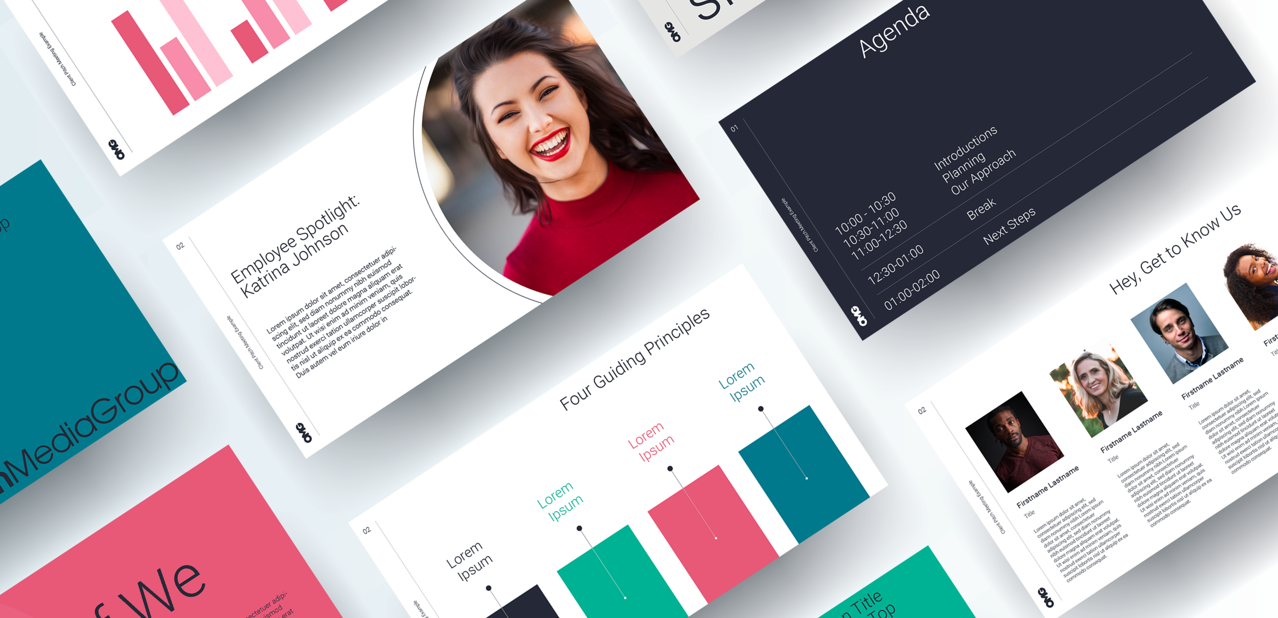
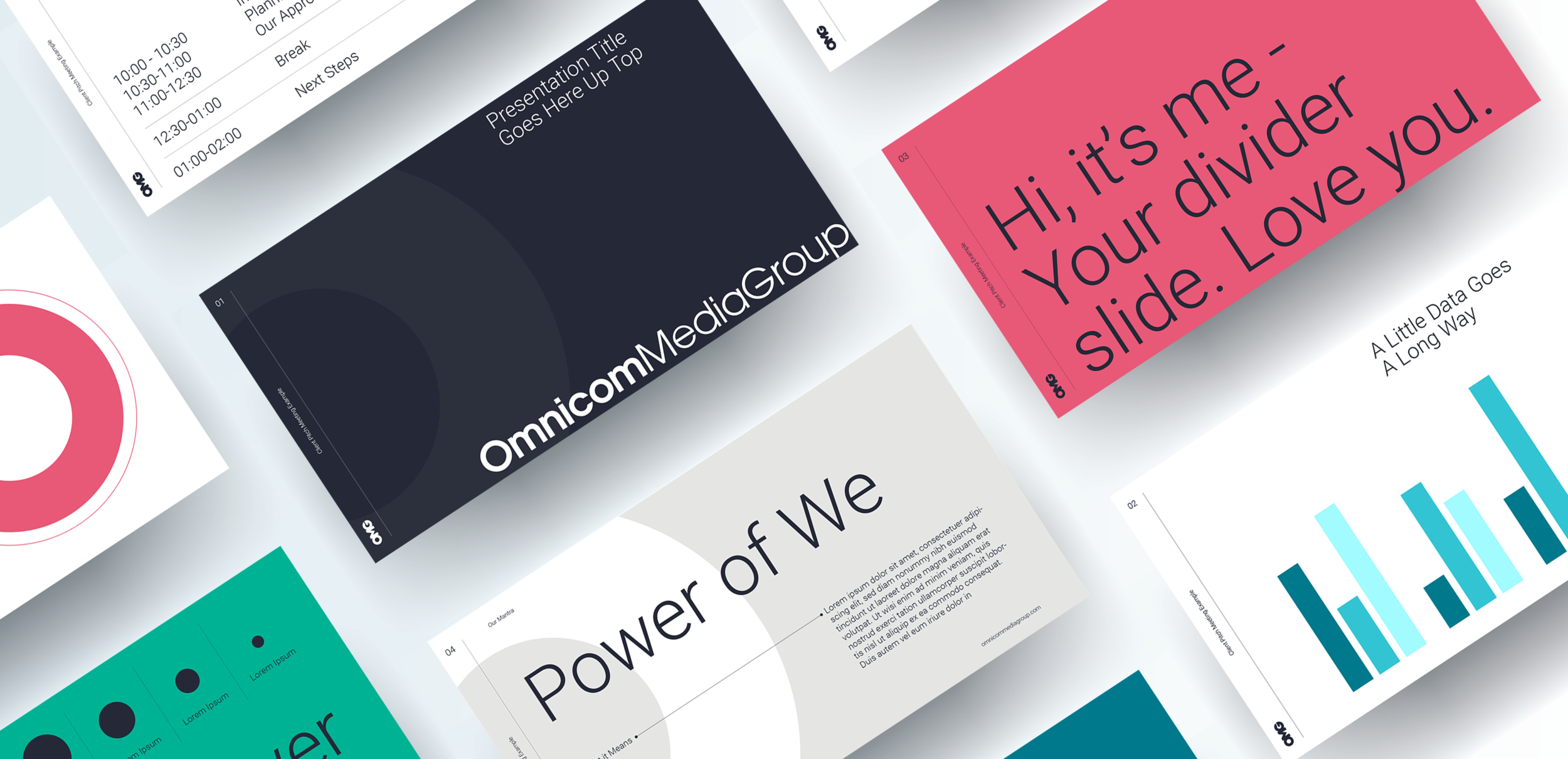
Shaking it Up
The refreshed template was built on a 12 x 12 grid, giving lots of flexibility in the build. Typically, PowerPoint presentations have a small, left-aligned slide title, horizontal text, etc. - all of the standard ingredients. I wanted to shake things up (especially for a corporate brand like Omnicom Media Group) by playing heavily with scale, and aligning to different points across the page. These choices result in a more interesting composition that will grab and hold attention.
Smarter Color
Previously, OMG lived in a world of white, blue and gray, relying heavily on imagery for visual impact. This template abandons traditional brand color hierarchy and incorporates OMG’s secondary palette as primary. Moving towards large swaths of these beautiful colors injects adrenaline into a presentation. Additionally, this reduces file sizes, which is crucial as we are now communicating almost entirely digitally.